wx.ListCtrl
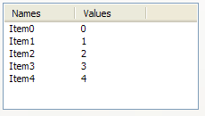
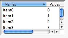
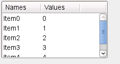
A list control presents lists in a number of formats: list view, report view, icon view and small icon view.
In any case, elements are numbered from zero. For all these modes, the items are stored in the control and must be added to it using wx.ListCtrl.InsertItem method.
A special case of report view quite different from the other modes of the list control is a virtual control in which the items data (including text, images and attributes) is managed by the main program and is requested by the control itself only when needed which allows having controls with millions of items without consuming much memory. To use virtual list control you must use wx.ListCtrl.SetItemCount first and override at least wx.ListCtrl.OnGetItemText (and optionally wx.ListCtrl.OnGetItemImage or wx.ListCtrl.OnGetItemColumnImage and wx.ListCtrl.OnGetItemAttr ) to return the information about the items when the control requests it.
Virtual list control can be used as a normal one except that no operations which can take time proportional to the number of items in the control happen
Using many of wx.ListCtrl features is shown in the corresponding sample.
To intercept events from a list control, use the event table macros described in wx.ListEvent.
Mac Note: Starting with wxWidgets 2.8, wx.ListCtrl uses a native implementation for report mode, and uses a generic implementation for other modes. You can use the generic implementation for report mode as well by setting the mac.listctrl.always_use_generic system option (see wx.SystemOptions) to 1.
 Window Styles
This class supports the following styles:
wx.LC_LIST: Multicolumn list view, with optional small icons. Columns are computed automatically, i.e. you don’t set columns as in LC_REPORT . In other words, the list wraps, unlike a wx.ListBox.
wx.LC_REPORT: Single or multicolumn report view, with optional header.
wx.LC_VIRTUAL: The application provides items text on demand. May only be used with LC_REPORT .
wx.LC_ICON: Large icon view, with optional labels.
wx.LC_SMALL_ICON: Small icon view, with optional labels.
wx.LC_ALIGN_TOP: Icons align to the top. Win32 default, Win32 only.
wx.LC_ALIGN_LEFT: Icons align to the left.
wx.LC_AUTOARRANGE: Icons arrange themselves. Win32 only.
wx.LC_EDIT_LABELS: Labels are editable: the application will be notified when editing starts.
wx.LC_NO_HEADER: No header in report mode.
wx.LC_SINGLE_SEL: Single selection (default is multiple).
wx.LC_SORT_ASCENDING: Sort in ascending order. (You must still supply a comparison callback in wx.ListCtrl.SortItems .)
wx.LC_SORT_DESCENDING: Sort in descending order. (You must still supply a comparison callback in wx.ListCtrl.SortItems .)
wx.LC_HRULES: Draws light horizontal rules between rows in report mode.
wx.LC_VRULES: Draws light vertical rules between columns in report mode.
 Events Emitted by this Class
Handlers bound for the following event types will receive a wx.ListEvent parameter.
EVT_LIST_BEGIN_DRAG: Begin dragging with the left mouse button. Processes a wxEVT_LIST_BEGIN_DRAG event type.
EVT_LIST_BEGIN_RDRAG: Begin dragging with the right mouse button. Processes a wxEVT_LIST_BEGIN_RDRAG event type.
EVT_BEGIN_LABEL_EDIT: Begin editing a label. This can be prevented by calling Veto(). Processes a wxEVT_LIST_BEGIN_LABEL_EDIT event type.
EVT_LIST_END_LABEL_EDIT: Finish editing a label. This can be prevented by calling Veto(). Processes a wxEVT_LIST_END_LABEL_EDIT event type.
EVT_LIST_DELETE_ITEM: An item was deleted. Processes a wxEVT_LIST_DELETE_ITEM event type.
EVT_LIST_DELETE_ALL_ITEMS: All items were deleted. Processes a wxEVT_LIST_DELETE_ALL_ITEMS event type.
EVT_LIST_ITEM_SELECTED: The item has been selected. Processes a wxEVT_LIST_ITEM_SELECTED event type.
EVT_LIST_ITEM_DESELECTED: The item has been deselected. Processes a wxEVT_LIST_ITEM_DESELECTED event type.
EVT_LIST_ITEM_ACTIVATED: The item has been activated (ENTER or double click). Processes a wxEVT_LIST_ITEM_ACTIVATED event type.
EVT_LIST_ITEM_FOCUSED: The currently focused item has changed. Processes a wxEVT_LIST_ITEM_FOCUSED event type.
EVT_LIST_ITEM_MIDDLE_CLICK: The middle mouse button has been clicked on an item. This is only supported by the generic control. Processes a wxEVT_LIST_ITEM_MIDDLE_CLICK event type.
EVT_LIST_ITEM_RIGHT_CLICK: The right mouse button has been clicked on an item. Processes a wxEVT_LIST_ITEM_RIGHT_CLICK event type.
EVT_LIST_KEY_DOWN: A key has been pressed. Processes a wxEVT_LIST_KEY_DOWN event type.
EVT_LIST_INSERT_ITEM: An item has been inserted. Processes a wxEVT_LIST_INSERT_ITEM event type.
EVT_LIST_COL_CLICK: A column (m_col) has been left-clicked. Processes a wxEVT_LIST_COL_CLICK event type.
EVT_LIST_COL_RIGHT_CLICK: A column (m_col) has been right-clicked. Processes a wxEVT_LIST_COL_RIGHT_CLICK event type.
EVT_LIST_COL_BEGIN_DRAG: The user started resizing a column - can be vetoed. Processes a wxEVT_LIST_COL_BEGIN_DRAG event type.
EVT_LIST_COL_DRAGGING: The divider between columns is being dragged. Processes a wxEVT_LIST_COL_DRAGGING event type.
EVT_LIST_COL_END_DRAG: A column has been resized by the user. Processes a wxEVT_LIST_COL_END_DRAG event type.
EVT_LIST_CACHE_HINT: Prepare cache for a virtual list control. Processes a wxEVT_LIST_CACHE_HINT event type.
See also
ListCtrl Overview, wx.ListView, wx.ListBox, wx.TreeCtrl, wx.ImageList, wx.ListEvent, wx.ListItem, wx.adv.EditableListBox
 Methods Summary
Default constructor. |
|
Append an item to the list control. The entry parameter should be a |
|
Adds a new column to the list control in report view mode. |
|
Arranges the items in icon or small icon view. |
|
Sets the image list associated with the control and takes ownership of it (i.e. |
|
Deletes all items and all columns. |
|
Creates the list control. |
|
Delete all columns in the list control. |
|
Deletes all items in the list control. |
|
Deletes a column. |
|
Deletes the specified item. |
|
Starts editing the label of the given item. |
|
Enable alternating row background colours (also called zebra striping). |
|
Enable or disable a beep if there is no match for the currently entered text when searching for the item from keyboard. |
|
Ensures this item is visible. |
|
Find an item whose label matches this string, starting from start or the beginning if start is |
|
Focus and show the given item. |
|
Gets information about this column. See SetItem() for more information. |
|
Returns the number of columns. |
|
Gets the column index from its position in visual order. |
|
Gets the column visual order position. |
|
Gets the column width (report view only). |
|
Returns the array containing the orders of all columns. |
|
Gets the number of items that can fit vertically in the visible area of the list control (list or report view) or the total number of items in the list control (icon or small icon view). |
|
Returns the edit control being currently used to edit a label. |
|
Returns the first selected item, or -1 when none is selected. |
|
Gets the currently focused item or -1 if none is focused. |
|
Returns the specified image list. |
|
Gets information about the item. See SetItem() for more information. |
|
Returns the colour for this item. |
|
Returns the number of items in the list control. |
|
Gets the application-defined data associated with this item. |
|
Returns the item’s font. |
|
Returns the position of the item, in icon or small icon view. |
|
Returns the rectangle representing the item’s size and position, in physical coordinates. |
|
Retrieves the spacing between icons in pixels: horizontal spacing is returned as |
|
Gets the item state. |
|
Gets the item text for this item. |
|
Returns the colour for this item. |
|
Searches for an item with the given geometry or state, starting from item but excluding the item itself. |
|
Returns subsequent selected items, or -1 when no more are selected. |
|
Returns the number of selected items in the list control. |
|
Returns the rectangle representing the size and position, in physical coordinates, of the given subitem, i.e. |
|
Gets the text colour of the list control. |
|
Gets the index of the topmost visible item when in list or report view. |
|
Returns the rectangle taken by all items in the control. |
|
Determines which item (if any) is at the specified point, giving details in flags. |
|
Determines which item (if any) is at the specified point, giving details in flags. |
|
Returns |
|
For report view mode (only), inserts a column. |
|
Inserts an item, returning the index of the new item if successful, -1 otherwise. |
|
Returns |
|
Returns |
|
This function may be overridden in the derived class for a control with |
|
Override this function in the derived class for a control with |
|
This function must be overridden in the derived class for a control with |
|
This function must be overridden in the derived class for a control with |
|
Redraws the given item. |
|
Redraws the items between itemFrom and itemTo. |
|
Scrolls the list control. |
|
Selects/deselects an item. |
|
Set the alternative row background colour to a specific colour. |
|
Sets the background colour. |
|
Sets information about this column. |
|
Sets the column width. |
|
Changes the order in which the columns are shown. |
|
Sets the image list associated with the control. |
|
Sets the data of an item. |
|
Sets the background colour for this item. |
|
Sets the image associated with the item. |
|
This method can only be used with virtual list controls. |
|
Associates application-defined data with this item. |
|
Sets the item’s font. |
|
Sets the unselected and selected images associated with the item. |
|
Sets the position of the item, in icon or small icon view. |
|
Sets the item state. |
|
Sets the item text for this item. |
|
Sets the colour for this item. |
|
Adds or removes a single window style. |
|
Sets the text colour of the list control. |
|
Sets the whole window style, deleting all items. |
|
Call this function to sort the items in the list control. |
 Properties Summary
See |
|
See |
|
See |
|
See |
|
See |
|
See |
|
See |
|
See |
|
See |
|
See |
|
See |
|
See |
|
See |
 Class API
wx.ListCtrl(Control)¶Possible constructors:
ListCtrl()

ListCtrl(parent, id=ID_ANY, pos=DefaultPosition, size=DefaultSize,
         style=LC_ICON, validator=DefaultValidator, name=ListCtrlNameStr)
A list control presents lists in a number of formats: list view, report view, icon view and small icon view.
__init__(self, *args, **kw)¶ Overloaded Implementations:
__init__ (self)
Default constructor.
__init__ (self, parent, id=ID_ANY, pos=DefaultPosition, size=DefaultSize, style=LC_ICON, validator=DefaultValidator, name=ListCtrlNameStr)
Constructor, creating and showing a list control.
parent (wx.Window) – Parent window. Must not be None.
id (wx.WindowID) – Window identifier. The value wx.ID_ANY indicates a default value.
pos (wx.Point) – Window position. If wx.DefaultPosition is specified then a default position is chosen.
size (wx.Size) – Window size. If wx.DefaultSize is specified then the window is sized appropriately.
style (long) – Window style. See wx.ListCtrl.
validator (wx.Validator) – Window validator.
name (string) – Window name.
See also
Append(self, entry)¶Append an item to the list control. The entry parameter should be a sequence with an item for each column
AppendColumn(self, heading, format=LIST_FORMAT_LEFT, width=-1)¶Adds a new column to the list control in report view mode.
This is just a convenient wrapper for InsertColumn which adds the new column after all the existing ones without having to specify its position explicitly.
heading (string) –
format (ListColumnFormat) –
width (int) –
long
New in version 2.9.4.
Arrange(self, flag=LIST_ALIGN_DEFAULT)¶Arranges the items in icon or small icon view.
This only has effect on Win32. flag is one of:
wx.LIST_ALIGN_DEFAULT: Default alignment.
wx.LIST_ALIGN_LEFT: Align to the left side of the control.
wx.LIST_ALIGN_TOP: Align to the top side of the control.
wx.LIST_ALIGN_SNAP_TO_GRID: Snap to grid.
flag (int) –
bool
AssignImageList(self, imageList, which)¶Sets the image list associated with the control and takes ownership of it (i.e.
the control will, unlike when using SetImageList , delete the list when destroyed). which is one of IMAGE_LIST_NORMAL , IMAGE_LIST_SMALL , IMAGE_LIST_STATE (the last is unimplemented).
imageList (wx.ImageList) –
which (int) –
See also
ClearAll(self)¶Deletes all items and all columns.
Note
This sends an event of type wxEVT_LIST_DELETE_ALL_ITEMS under all platforms.
ClearColumnImage(self, col)¶Create(self, parent, id=ID_ANY, pos=DefaultPosition, size=DefaultSize, style=LC_ICON, validator=DefaultValidator, name=ListCtrlNameStr)¶Creates the list control.
See wx.ListCtrl for further details.
parent (wx.Window) –
id (wx.WindowID) –
pos (wx.Point) –
size (wx.Size) –
style (long) –
validator (wx.Validator) –
name (string) –
bool
DeleteAllColumns(self)¶Delete all columns in the list control.
bool
True if all columns were successfully deleted, False otherwise.
DeleteAllItems(self)¶Deletes all items in the list control.
This function does not send the wxEVT_LIST_DELETE_ITEM event because deleting many items from the control would be too slow then (unlike wx.ListCtrl.DeleteItem ) but it does send the special wxEVT_LIST_DELETE_ALL_ITEMS event if the control was not empty. If it was already empty, nothing is done and no event is sent.
bool
True if the items were successfully deleted or if the control was already empty, False if an error occurred while deleting the items.
DeleteColumn(self, col)¶Deletes a column.
col (int) –
bool
DeleteItem(self, item)¶Deletes the specified item.
This function sends the wxEVT_LIST_DELETE_ITEM event for the item being deleted.
item (long) –
bool
See also
EditLabel(self, item)¶Starts editing the label of the given item.
This function generates a EVT_LIST_BEGIN_LABEL_EDIT event which can be vetoed so that no text control will appear for in-place editing.
If the user changed the label (i.e. s/he does not press ESC or leave the text control without changes, a EVT_LIST_END_LABEL_EDIT event will be sent which can be vetoed as well.
item (long) –
EnableAlternateRowColours(self, enable=True)¶Enable alternating row background colours (also called zebra striping).
This method can only be called for the control in virtual report mode, i.e. having LC_REPORT and LC_VIRTUAL styles.
When enabling alternating colours, the appropriate colour for the even rows is chosen automatically depending on the default foreground and background colours which are used for the odd rows.
enable (bool) – If True, enable alternating row background colours, i.e. different colours for the odd and even rows. If False, disable this feature and use the same background colour for all rows.
New in version 2.9.5.
See also
EnableBellOnNoMatch(self, on=True)¶Enable or disable a beep if there is no match for the currently entered text when searching for the item from keyboard.
The default is to not beep in this case except in wxMSW where the beep is always generated by the native control and cannot be disabled, i.e. calls to this function do nothing there.
on (bool) –
New in version 2.9.5.
EnsureVisible(self, item)¶Ensures this item is visible.
item (long) –
bool
FindItem(self, *args, **kw)¶ Overloaded Implementations:
FindItem (self, start, str, partial=False)
Find an item whose label matches this string, starting from start or the beginning if start is -1 .
The string comparison is case insensitive.
If partial is True then this method will look for items which begin with str.
start (long) –
str (string) –
partial (bool) –
long
The next matching item if any or -1 (wx``wx.NOT_FOUND``) otherwise.
FindItem (self, start, data)
Find an item whose data matches this data, starting from start or the beginning if ‘start’ is -1 .
FindItem (self, start, pt, direction)
Find an item nearest this position in the specified direction, starting from start or the beginning if start is -1.
Focus(self, idx)¶Focus and show the given item.
GetClassDefaultAttributes(variant=WINDOW_VARIANT_NORMAL)¶variant (WindowVariant) –
GetColumn(self, col)¶Gets information about this column. See SetItem() for more information.
GetColumnCount(self)¶Returns the number of columns.
int
GetColumnIndexFromOrder(self, pos)¶Gets the column index from its position in visual order.
After calling SetColumnsOrder , the index returned by this function corresponds to the value of the element number pos in the array returned by GetColumnsOrder .
Please see SetColumnsOrder documentation for an example and additional remarks about the columns ordering.
pos (int) –
int
See also
GetColumnOrder(self, col)¶Gets the column visual order position.
This function returns the index of the column which appears at the given visual position, e.g. calling it with col equal to 0 returns the index of the first shown column.
Please see SetColumnsOrder documentation for an example and additional remarks about the columns ordering.
col (int) –
int
See also
GetColumnWidth(self, col)¶Gets the column width (report view only).
col (int) –
int
GetColumnsOrder(self)¶Returns the array containing the orders of all columns.
On error, an empty array is returned.
Please see SetColumnsOrder documentation for an example and additional remarks about the columns ordering.
list of integers
See also
GetCountPerPage(self)¶Gets the number of items that can fit vertically in the visible area of the list control (list or report view) or the total number of items in the list control (icon or small icon view).
int
GetEditControl(self)¶Returns the edit control being currently used to edit a label.
Returns None if no label is being edited.
Note
It is currently only implemented for wxMSW and the generic version, not for the native Mac OS X version.
GetFirstSelected(self, *args)¶Returns the first selected item, or -1 when none is selected.
GetFocusedItem(self)¶Gets the currently focused item or -1 if none is focused.
GetImageList(self, which)¶Returns the specified image list.
which may be one of:
wx.IMAGE_LIST_NORMAL: The normal (large icon) image list.
wx.IMAGE_LIST_SMALL: The small icon image list.
wx.IMAGE_LIST_STATE: The user-defined state image list (unimplemented).
which (int) –
GetItem(self, itemIdx, col=0)¶Gets information about the item. See SetItem() for more information.
GetItemBackgroundColour(self, item)¶Returns the colour for this item.
If the item has no specific colour, returns an invalid colour (and not the default background control of the control itself).
item (long) –
See also
GetItemCount(self)¶Returns the number of items in the list control.
int
GetItemData(self, item)¶Gets the application-defined data associated with this item.
item (long) –
long
GetItemPosition(self, item)¶Returns the position of the item, in icon or small icon view.
GetItemRect(self, item, code=LIST_RECT_BOUNDS)¶Returns the rectangle representing the item’s size and position, in physical coordinates. code is one of wx.``wx.LIST_RECT_BOUNDS``, wx.``wx.LIST_RECT_ICON``, wx.``wx.LIST_RECT_LABEL``.
GetItemSpacing(self)¶Retrieves the spacing between icons in pixels: horizontal spacing is returned as x component of the wx.Size object and the vertical spacing as its y component.
GetItemState(self, item, stateMask)¶Gets the item state.
For a list of state flags, see SetItem . The stateMask indicates which state flags are of interest.
item (long) –
stateMask (long) –
int
GetItemText(self, item, col=0)¶Gets the item text for this item.
item (long) – Item (zero-based) index.
col (int) – Item column (zero-based) index. Column 0 is the default. This parameter is new in wxWidgets 2.9.1.
string
GetItemTextColour(self, item)¶Returns the colour for this item.
If the item has no specific colour, returns an invalid colour (and not the default foreground control of the control itself as this wouldn’t allow distinguishing between items having the same colour as the current control foreground and items with default colour which, hence, have always the same colour as the control).
item (long) –
GetNextItem(self, item, geometry=LIST_NEXT_ALL, state=LIST_STATE_DONTCARE)¶Searches for an item with the given geometry or state, starting from item but excluding the item itself.
If item is -1, the first item that matches the specified flags will be returned. Returns the first item with given state following item or -1 if no such item found. This function may be used to find all selected items in the control like this:
item = -1

while 1:
    item = listctrl.GetNextItem(item,
                                wx.LIST_NEXT_ALL,
                                wx.LIST_STATE_SELECTED)
    if item == -1:
        break

    # This item is selected - do whatever is needed with it
    wx.LogMessage("Item %ld is selected"%item)
geometry can be one of:
wx.LIST_NEXT_ABOVE: Searches for an item above the specified item.
wx.LIST_NEXT_ALL: Searches for subsequent item by index.
wx.LIST_NEXT_BELOW: Searches for an item below the specified item.
wx.LIST_NEXT_LEFT: Searches for an item to the left of the specified item.
wx.LIST_NEXT_RIGHT: Searches for an item to the right of the specified item.
state can be a bitlist of the following:
wx.LIST_STATE_DONTCARE: Don’t care what the state is.
wx.LIST_STATE_DROPHILITED: The item indicates it is a drop target.
wx.LIST_STATE_FOCUSED: The item has the focus.
wx.LIST_STATE_SELECTED: The item is selected.
wx.LIST_STATE_CUT: The item is selected as part of a cut and paste operation.
item (long) –
geometry (int) –
state (int) –
long
Note
this parameter is only supported by wxMSW currently and ignored on other platforms.
GetNextSelected(self, item)¶Returns subsequent selected items, or -1 when no more are selected.
GetSelectedItemCount(self)¶Returns the number of selected items in the list control.
int
GetSubItemRect(self, item, subItem, rect, code=LIST_RECT_BOUNDS)¶Returns the rectangle representing the size and position, in physical coordinates, of the given subitem, i.e.
the part of the row item in the column subItem.
This method is only meaningful when the wx.ListCtrl is in the report mode. If subItem parameter is equal to the special value LIST_GETSUBITEMRECT_WHOLEITEM the return value is the same as for GetItemRect .
code can be one of LIST_RECT_BOUNDS , LIST_RECT_ICON or LIST_RECT_LABEL .
item (long) –
subItem (long) –
rect (wx.Rect) –
code (int) –
bool
New in version 2.7.0.
GetTopItem(self)¶Gets the index of the topmost visible item when in list or report view.
long
GetViewRect(self)¶Returns the rectangle taken by all items in the control.
In other words, if the controls client size were equal to the size of this rectangle, no scrollbars would be needed and no free space would be left.
Note that this function only works in the icon and small icon views, not in list or report views (this is a limitation of the native Win32 control).
HasColumnOrderSupport(self)¶bool
HitTest(self, point)¶Determines which item (if any) is at the specified point, giving details in flags.
Returns index of the item or NOT_FOUND if no item is at the specified point.
flags will be a combination of the following flags:
wx.LIST_HITTEST_ABOVE: Above the client area.
wx.LIST_HITTEST_BELOW: Below the client area.
wx.LIST_HITTEST_NOWHERE: In the client area but below the last item.
wx.LIST_HITTEST_ONITEMICON: On the bitmap associated with an item.
wx.LIST_HITTEST_ONITEMLABEL: On the label (string) associated with an item.
wx.LIST_HITTEST_ONITEMRIGHT: In the area to the right of an item.
wx.LIST_HITTEST_ONITEMSTATEICON: On the state icon for a tree view item that is in a user-defined state.
wx.LIST_HITTEST_TOLEFT: To the right of the client area.
wx.LIST_HITTEST_TORIGHT: To the left of the client area.
wx.LIST_HITTEST_ONITEM: Combination of LIST_HITTEST_ONITEMICON , LIST_HITTEST_ONITEMLABEL , LIST_HITTEST_ONITEMSTATEICON .
If ptrSubItem is not None and the wx.ListCtrl is in the report mode the subitem (or column) number will also be provided. This feature is only available in version 2.7.0 or higher and is currently only implemented under wxMSW and requires at least comctl32.dll of version 4.70 on the host system or the value stored in ptrSubItem will be always -1. To compile this feature into wxWidgets library you need to have access to commctrl.h of version 4.70 that is provided by Microsoft.
HitTestSubItem(self, itTestSubItem(point)¶Determines which item (if any) is at the specified point, giving details in flags.
tuple
( item, flags, subitem )
InReportView(self)¶Returns True if the control is currently using LC_REPORT style.
bool
InsertColumn(self, *args, **kw)¶ Overloaded Implementations:
InsertColumn (self, col, info)
For report view mode (only), inserts a column.
For more details, see SetItem . Also see InsertColumn(long, String &, int, int) overload for a usually more convenient alternative to this method and the description of how the item width is interpreted by this method.
col (long) –
info (wx.ListItem) –
long
InsertColumn (self, col, heading, format=LIST_FORMAT_LEFT, width=LIST_AUTOSIZE)
For report view mode (only), inserts a column.
Insert a new column in the list control in report view mode at the given position specifying its most common attributes.
Notice that to set the image for the column you need to use Insert(long, ListItem&) overload and specify LIST_MASK_IMAGE in the item mask.
col (long) – The index where the column should be inserted. Valid indices are from 0 up to GetColumnCount inclusive and the latter can be used to append the new column after the last existing one.
heading (string) – The string specifying the column heading.
format (int) – The flags specifying the control heading text alignment.
width (int) – If positive, the width of the column in pixels. Otherwise it can be LIST_AUTOSIZE to choose the default size for the column or LIST_AUTOSIZE_USEHEADER to fit the column width to heading or to extend to fill all the remaining space for the last column. Notice that in case of LIST_AUTOSIZE fixed width is used as there are no items in this column to use for determining its best size yet. If you want to fit the column to its contents, use SetColumnWidth after adding the items with values in this column.
long
The index of the inserted column or -1 if adding it failed.
InsertItem(self, *args, **kw)¶ Overloaded Implementations:
InsertItem (self, info)
Inserts an item, returning the index of the new item if successful, -1 otherwise.
info (wx.ListItem) – wx.ListItem object
long
InsertItem (self, index, label)
Insert an string item.
index (long) – Index of the new item, supplied by the application
label (string) – String label
long
InsertItem (self, index, imageIndex)
Insert an image item.
index (long) – Index of the new item, supplied by the application
imageIndex (int) – Index into the image list associated with this control and view style
long
InsertItem (self, index, label, imageIndex)
Insert an image/string item.
index (long) – Index of the new item, supplied by the application
label (string) – String label
imageIndex (int) – Index into the image list associated with this control and view style
long
IsSelected(self, idx)¶Returns True if the item is selected.
IsVirtual(self)¶Returns True if the control is currently in virtual report view.
bool
OnGetItemAttr(self, item)¶This function may be overridden in the derived class for a control with LC_VIRTUAL style.
It should return the attribute for the specified item or None to use the default appearance parameters.
wx.ListCtrl will not delete the pointer or keep a reference of it. You can return the same wx.ListItemAttr pointer for every OnGetItemAttr call.
The base class version always returns None.
item (long) –
See also
OnGetItemImage , OnGetItemColumnImage , OnGetItemText , OnGetItemColumnAttr
OnGetItemColumnImage(self, item, column)¶Override this function in the derived class for a control with LC_VIRTUAL and LC_REPORT styles in order to specify the image index for the given line and column.
The base class version always calls OnGetItemImage for the first column, else it returns -1.
item (long) –
column (long) –
int
See also
OnGetItemText , OnGetItemImage , OnGetItemAttr , OnGetItemColumnAttr
OnGetItemImage(self, item)¶This function must be overridden in the derived class for a control with LC_VIRTUAL style having an “image list” (see SetImageList ; if the control doesn’t have an image list, it is not necessary to override it).
It should return the index of the items image in the controls image list or -1 for no image.
In a control with LC_REPORT style, OnGetItemImage only gets called for the first column of each line.
The base class version always returns -1.
item (long) –
int
See also
OnGetItemText(self, item, column)¶This function must be overridden in the derived class for a control with LC_VIRTUAL style.
It should return the string containing the text of the given column for the specified item .
item (long) –
column (long) –
string
See also
SetItemCount , OnGetItemImage , OnGetItemColumnImage , OnGetItemAttr
RefreshItem(self, item)¶Redraws the given item.
This is only useful for the virtual list controls as without calling this function the displayed value of the item doesn’t change even when the underlying data does change.
item (long) –
See also
RefreshItems(self, itemFrom, itemTo)¶Redraws the items between itemFrom and itemTo.
The starting item must be less than or equal to the ending one.
Just as RefreshItem this is only useful for virtual list controls.
itemFrom (long) –
itemTo (long) –
ScrollList(self, dx, dy)¶Scrolls the list control.
If in icon, small icon or report view mode, dx specifies the number of pixels to scroll. If in list view mode, dx specifies the number of columns to scroll. dy always specifies the number of pixels to scroll vertically.
dx (int) –
dy (int) –
bool
Note
This method is currently only implemented in the Windows version.
Select(self, idx, on=1)¶Selects/deselects an item.
SetAlternateRowColour(self, colour)¶Set the alternative row background colour to a specific colour.
It is recommended to call EnableAlternateRowColours instead of using these methods as native implementations of this control might support alternating row colours but not setting the exact colour to be used for them.
As EnableAlternateRowColours , this method can only be used with controls having LC_REPORT and LC_VIRTUAL styles.
colour (wx.Colour) – A valid alternative row background colour to enable alternating rows or invalid colour to disable them and use the same colour for all rows.
New in version 2.9.5.
SetBackgroundColour(self, col)¶Sets the background colour.
Note that the wx.Window.GetBackgroundColour function of wx.Window base class can be used to retrieve the current background colour.
col (wx.Colour) –
bool
SetColumn(self, col, item)¶Sets information about this column.
See SetItem for more information.
col (int) –
item (wx.ListItem) –
bool
SetColumnImage(self, col, image)¶SetColumnWidth(self, col, width)¶Sets the column width.
width can be a width in pixels or LIST_AUTOSIZE (-1) or LIST_AUTOSIZE_USEHEADER (-2).
LIST_AUTOSIZEwill resize the column to the length of its longest item.
LIST_AUTOSIZE_USEHEADERwill resize the column to the length of the header (Win32) or 80 pixels (other platforms).
In small or normal icon view, col must be -1, and the column width is set for all columns.
col (int) –
width (int) –
bool
SetColumnsOrder(self, orders)¶Changes the order in which the columns are shown.
By default, the columns of a list control appear on the screen in order of their indices, i.e. the column 0 appears first, the column 1 next and so on. However by using this function it is possible to arbitrarily reorder the columns visual order and the user can also rearrange the columns interactively by dragging them. In this case, the index of the column is not the same as its order and the functions GetColumnOrder and GetColumnIndexFromOrder should be used to translate between them. Notice that all the other functions still work with the column indices, i.e. the visual positioning of the columns on screen doesn’t affect the code setting or getting their values for example.
The orders array must have the same number elements as the number of columns and contain each position exactly once. Its n-th element contains the index of the column to be shown in n-th position, so for a control with three columns passing an array with elements 2, 0 and 1 results in the third column being displayed first, the first one next and the second one last.
Example of using it:
listCtrl = wx.ListCtrl(parent, style=wx.LC_REPORT)

for i in range(3):
    listCtrl.InsertColumn(i, "Column %d"%i)

order = [2, 0, 1]
listCtrl.SetColumnsOrder(order)

# now listCtrl.GetColumnsOrder() will return order and
# listCtrl.GetColumnIndexFromOrder(n) will return order[n] and
# listCtrl.GetColumnOrder() will return 1, 2 and 0 for the column 0,
# 1 and 2 respectively
Please notice that this function makes sense for report view only and currently is only implemented in wxMSW port. To avoid explicit tests for WXMSW in your code, please use HAS_LISTCTRL_COLUMN_ORDER as this will allow it to start working under the other platforms when support for the column reordering is added there.
orders (list of integers) –
bool
See also
SetImageList(self, imageList, which)¶Sets the image list associated with the control.
which is one of IMAGE_LIST_NORMAL , IMAGE_LIST_SMALL , IMAGE_LIST_STATE (the last is unimplemented).
This method does not take ownership of the image list, you have to delete it yourself.
imageList (wx.ImageList) –
which (int) –
See also
SetItem(self, *args, **kw)¶ Overloaded Implementations:
SetItem (self, info)
Sets the data of an item.
Using the wx.ListItem’s mask and state mask, you can change only selected attributes of a wx.ListCtrl item.
info (wx.ListItem) –
bool
SetItem (self, index, column, label, imageId=-1)
Sets an item string field at a particular column.
index (long) –
column (int) –
label (string) –
imageId (int) –
long
SetItemBackgroundColour(self, item, col)¶Sets the background colour for this item.
This function only works in report view mode. The colour can be retrieved using GetItemBackgroundColour .
item (long) –
col (wx.Colour) –
SetItemColumnImage(self, item, column, image)¶Sets the image associated with the item.
In report view, you can specify the column. The image is an index into the image list associated with the list control.
item (long) –
column (long) –
image (int) –
bool
SetItemCount(self, count)¶This method can only be used with virtual list controls.
It is used to indicate to the control the number of items it contains. After calling it, the main program should be ready to handle calls to various item callbacks (such as wx.ListCtrl.OnGetItemText ) for all items in the range from 0 to count.
Notice that the control is not necessarily redrawn after this call as it may be undesirable if an item which is not visible on the screen anyhow was added to or removed from a control displaying many items, if you do need to refresh the display you can just call Refresh manually.
count (long) –
SetItemData(self, item, data)¶Associates application-defined data with this item.
Notice that this function cannot be used to associate pointers with the control items, use SetItemPtrData instead.
item (long) –
data (long) –
bool
SetItemImage(self, item, image, selImage=-1)¶Sets the unselected and selected images associated with the item.
The images are indices into the image list associated with the list control.
item (long) –
image (int) –
selImage (int) –
bool
SetItemPosition(self, item, pos)¶Sets the position of the item, in icon or small icon view.
Windows only.
item (long) –
pos (wx.Point) –
bool
SetItemState(self, item, state, stateMask)¶Sets the item state.
The stateMask is a combination of LIST_STATE_XXX constants described in wx.ListItem documentation. For each of the bits specified in stateMask, the corresponding state is set or cleared depending on whether state argument contains the same bit or not.
So to select an item you can use
listCtrl.SetItemState(item, wx.LIST_STATE_SELECTED, wx.LIST_STATE_SELECTED)
while to deselect it you should use
listCtrl.SetItemState(item, 0, wx.LIST_STATE_SELECTED)
Consider using wx.ListView if possible to avoid dealing with this error-prone and confusing method.
item (long) –
state (long) –
stateMask (long) –
bool
SetItemText(self, item, text)¶Sets the item text for this item.
item (long) –
text (string) –
SetItemTextColour(self, item, col)¶Sets the colour for this item.
This function only works in report view. The colour can be retrieved using GetItemTextColour .
item (long) –
col (wx.Colour) –
SetSingleStyle(self, style, add=True)¶Adds or removes a single window style.
style (long) –
add (bool) –
SetWindowStyleFlag(self, style)¶Sets the whole window style, deleting all items.
style (long) –
SortItems(self, fnSortCallBack)¶Call this function to sort the items in the list control.
Sorting is done using the specified fnSortCallBack function. This function must have the following prototype:
def ListCompareFunction(self, item1, item2):

    pass
It is called each time when the two items must be compared and should return 0 if the items are equal, negative value if the first item is less than the second one and positive value if the first one is greater than the second one (the same convention as used by qsort(3) ).
The parameter item1 is the client data associated with the first item (NOT the index). The parameter item2 is the client data associated with the second item (NOT the index). The parameter data is the value passed to SortItems itself.
Notice that the control may only be sorted on client data associated with the items, so you must use SetItemData if you want to be able to sort the items in the control.
Please see the List Control Sample for an example of using this function.
ColumnCount¶See GetColumnCount
ColumnsOrder¶See GetColumnsOrder and SetColumnsOrder
CountPerPage¶See GetCountPerPage
EditControl¶See GetEditControl
FocusedItem¶See GetFocusedItem
ItemCount¶See GetItemCount and SetItemCount
ItemPosition¶See GetItemPosition and SetItemPosition
ItemRect¶See GetItemRect
ItemSpacing¶See GetItemSpacing
MainWindow¶See GetMainWindow
SelectedItemCount¶TextColour¶See GetTextColour and SetTextColour
TopItem¶See GetTopItem
ViewRect¶See GetViewRect


 Inheritance diagram for class ListCtrl: