wx.RadioButton
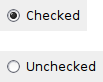
A radio button item is a button which usually denotes one of several mutually exclusive options.
It has a text label next to a (usually) round button.
You can create a group of mutually-exclusive radio buttons by specifying RB_GROUP for the first in the group. The group ends when another radio button group is created, or there are no more radio buttons.
 Window Styles
This class supports the following styles:
wx.RB_GROUP: Marks the beginning of a new group of radio buttons.
wx.RB_SINGLE: In some circumstances, radio buttons that are not consecutive siblings trigger a hang bug in Windows (only). If this happens, add this style to mark the button as not belonging to a group, and implement the mutually-exclusive group behaviour yourself.
 Events Emitted by this Class
Handlers bound for the following event types will receive a wx.CommandEvent parameter.
EVT_RADIOBUTTON: Process a wxEVT_RADIOBUTTON event, when the radiobutton is clicked.
See also
 Methods Summary
Default constructor. |
|
Creates the choice for two-step construction. |
|
Returns |
|
Sets the radio button to checked or unchecked status. |
 Class API
wx.RadioButton(Control)¶Possible constructors:
RadioButton()

RadioButton(parent, id=ID_ANY, label="", pos=DefaultPosition,
            size=DefaultSize, style=0, validator=DefaultValidator,
            name=RadioButtonNameStr)
A radio button item is a button which usually denotes one of several mutually exclusive options.
__init__(self, *args, **kw)¶ Overloaded Implementations:
__init__ (self)
Default constructor.
See also
__init__ (self, parent, id=ID_ANY, label=””, pos=DefaultPosition, size=DefaultSize, style=0, validator=DefaultValidator, name=RadioButtonNameStr)
Constructor, creating and showing a radio button.
parent (wx.Window) – Parent window. Must not be None.
id (wx.WindowID) – Window identifier. The value ID_ANY indicates a default value.
label (string) – Label for the radio button.
pos (wx.Point) – Window position. If wx.DefaultPosition is specified then a default position is chosen.
size (wx.Size) – Window size. If wx.DefaultSize is specified then a default size is chosen.
style (long) – Window style. See wx.RadioButton.
validator (wx.Validator) – Window validator.
name (string) – Window name.
See also
Create(self, parent, id=ID_ANY, label="", pos=DefaultPosition, size=DefaultSize, style=0, validator=DefaultValidator, name=RadioButtonNameStr)¶Creates the choice for two-step construction.
See wx.RadioButton for further details.
parent (wx.Window) –
id (wx.WindowID) –
label (string) –
pos (wx.Point) –
size (wx.Size) –
style (long) –
validator (wx.Validator) –
name (string) –
bool
GetClassDefaultAttributes(variant=WINDOW_VARIANT_NORMAL)¶variant (WindowVariant) –
GetValue(self)¶Returns True if the radio button is checked, False otherwise.
bool
SetValue(self, value)¶Sets the radio button to checked or unchecked status.
This does not cause a wxEVT_RADIOBUTTON event to get emitted.
If the radio button belongs to a radio group exactly one button in the group may be checked and so this method can be only called with value set to True. To uncheck a radio button in a group you must check another button in the same group.
value (bool) – True to check, False to uncheck.


 Inheritance diagram for class RadioButton: