wx.adv.BitmapComboBox
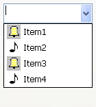
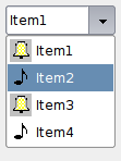
A combobox that displays bitmap in front of the list items.
It currently only allows using bitmaps of one size, and resizes itself so that a bitmap can be shown next to the text field.
 Window Styles
This class supports the following styles:
wx.CB_READONLY: Creates a combobox without a text editor. On some platforms the control may appear very different when this style is used.
wx.CB_SORT: Sorts the entries in the list alphabetically.
wx.TE_PROCESS_ENTER: The control will generate the event wxEVT_TEXT_ENTER (otherwise pressing Enter key is either processed internally by the control or used for navigation between dialog controls). Windows only.
 Events Emitted by this Class
Handlers bound for the following event types will receive a wx.CommandEvent parameter.
EVT_COMBOBOX: Process a wxEVT_COMBOBOX event, when an item on the list is selected.
EVT_TEXT: Process a wxEVT_TEXT event, when the combobox text changes.
EVT_TEXT_ENTER: Process a wxEVT_TEXT_ENTER event, when RETURN is pressed in the combobox.
Note
While wx.adv.BitmapComboBox contains the wx.ComboBox API, but it might not actually be derived from that class. In fact, if the platform does not have a native implementation, wx.adv.BitmapComboBox will inherit from wx.adv.OwnerDrawnComboBox. You can determine if the implementation is generic by checking whether GENERIC_BITMAPCOMBOBOX is defined. Currently wx.adv.BitmapComboBox is implemented natively for MSW and GTK+.
See also
wx.ComboBox, wx.Choice, wx.adv.OwnerDrawnComboBox, wx.CommandEvent
Todo
create CB_PROCESS_ENTER rather than reusing wx.TE_PROCESS_ENTER!
 Methods Summary
Default constructor. |
|
Adds the item to the end of the combo box. |
|
Creates the combobox for two-step construction. |
|
Returns the size of the bitmaps used in the combo box. |
|
Returns the bitmap of the item with the given index. |
|
Inserts the item into the list before pos. |
|
Sets the bitmap for the given item. |
 Class API
wx.adv.BitmapComboBox(Control, TextEntry, ItemContainer)¶Possible constructors:
BitmapComboBox()

BitmapComboBox(parent, id=ID_ANY, value="", pos=DefaultPosition,
               size=DefaultSize, choices=[], style=0, validator=DefaultValidator,
               name=BitmapComboBoxNameStr)
A combobox that displays bitmap in front of the list items.
__init__(self, *args, **kw)¶ Overloaded Implementations:
__init__ (self)
Default constructor.
__init__ (self, parent, id=ID_ANY, value=””, pos=DefaultPosition, size=DefaultSize, choices=[], style=0, validator=DefaultValidator, name=BitmapComboBoxNameStr)
Constructor, creating and showing a combobox.
parent (wx.Window) – Parent window. Must not be None.
id (wx.WindowID) – Window identifier. The value wx.ID_ANY indicates a default value.
value (string) – Initial selection string. An empty string indicates no selection.
pos (wx.Point) – Initial position.
size (wx.Size) – Initial size.
choices (list of strings) – An list of strings with which to initialise the control.
style (long) – The window style, see CB_ flags.
validator (wx.Validator) – Validator which can be used for additional data checks.
name (string) – Control name.
See also
Append(self, *args, **kw)¶ Overloaded Implementations:
Append (self, item, bitmap=NullBitmap)
Adds the item to the end of the combo box.
item (string) –
bitmap (wx.Bitmap) –
int
Append (self, item, bitmap, clientData)
Adds the item to the end of the combo box, associating the given typed client data pointer clientData with the item.
item (string) –
bitmap (wx.Bitmap) –
clientData (ClientData) –
int
Create(self, parent, id=ID_ANY, value="", pos=DefaultPosition, size=DefaultSize, choices=[], style=0, validator=DefaultValidator, name=BitmapComboBoxNameStr)¶Creates the combobox for two-step construction.
parent (wx.Window) –
id (wx.WindowID) –
value (string) –
pos (wx.Point) –
size (wx.Size) –
choices (list of strings) –
style (long) –
validator (wx.Validator) –
name (string) –
bool
GetBitmapSize(self)¶Returns the size of the bitmaps used in the combo box.
If the combo box is empty, then wx.DefaultSize is returned.
Size
GetClassDefaultAttributes(variant=WINDOW_VARIANT_NORMAL)¶variant (WindowVariant) –
VisualAttributes
GetItemBitmap(self, n)¶Returns the bitmap of the item with the given index.
n (int) –
Bitmap
Insert(self, *args, **kw)¶ Overloaded Implementations:
Insert (self, item, bitmap, pos)
Inserts the item into the list before pos.
Not valid for CB_SORT style, use Append instead.
item (string) –
bitmap (wx.Bitmap) –
pos (int) –
int
Insert (self, item, bitmap, pos, clientData)
Inserts the item into the list before pos, associating the given typed client data pointer with the item.
Not valid for CB_SORT style, use Append instead.
item (string) –
bitmap (wx.Bitmap) –
pos (int) –
clientData (ClientData) –
int
SetItemBitmap(self, n, bitmap)¶Sets the bitmap for the given item.
n (int) –
bitmap (wx.Bitmap) –
BitmapSize¶See GetBitmapSize


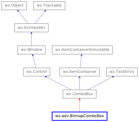
 Inheritance diagram for class BitmapComboBox: