Navigation

- Home |
- Gallery |
- API Docs »
- wx.lib »
- wx.lib.agw »
- wx.lib.agw.gradientbutton »
- wx.lib.agw.gradientbutton.GradientButton
- index
- modules |
- next |
- previous |
 wx.lib.agw.gradientbutton.GradientButton
This is the main class implementation of GradientButton.
 Methods Summary
Default class constructor. |
|
Can this window be given focus by mouse click? |
|
Overridden base class virtual. Determines the best size of the |
|
Enables/disables the button. |
|
Returns the bottom end colour for the gradient shading. |
|
Returns the bottom start colour for the gradient shading. |
|
Overridden base class virtual. By default we should use |
|
Returns a rounded |
|
Returns the pressed bottom start colour for the gradient shading. |
|
Returns the pressed top start colour for the gradient shading. |
|
Returns the top end colour for the gradient shading. |
|
Returns the top start colour for the gradient shading. |
|
Return light contrast of colour. The colour returned is from the scale of |
|
Actually sends a |
|
Handles the |
|
Handles the |
|
Handles the |
|
Handles the |
|
Handles the |
|
Handles the |
|
Handles the |
|
Handles the |
|
Handles the |
|
Handles the |
|
Sets the bottom, top, pressed and foreground colour |
|
Sets the bitmap label for the button. |
|
Sets the bottom end colour for the gradient shading. |
|
Sets the top bottom colour for the gradient shading. |
|
Sets the default button. |
|
Sets the |
|
Given the current font and bezel width settings, calculate |
|
Sets the pressed bottom start colour for the gradient shading. |
|
Sets the pressed top start colour for the gradient shading. |
|
Sets the top end colour for the gradient shading. |
|
Sets the top start colour for the gradient shading. |
|
Overridden base class virtual. Buttons usually don’t inherit |
 Class API
This is the main class implementation of GradientButton.
Default class constructor.
parent – the GradientButton parent;
id – window identifier. A value of -1 indicates a default value;
bitmap – the button bitmap (if any);
label – the button text label;
pos – the control position. A value of (-1, -1) indicates a default position, chosen by either the windowing system or wxPython, depending on platform;
size – the control size. A value of (-1, -1) indicates a default size, chosen by either the windowing system or wxPython, depending on platform;
style – the button style (unused);
align – text/bitmap alignment. wx.CENTER or wx.LEFT;
validator – the validator associated to the button;
name – the button name.
Can this window be given focus by mouse click?
Note
Overridden from wx.Control.
Overridden base class virtual. Determines the best size of the button based on the label and bezel size.
Note
Overridden from wx.Control.
Enables/disables the button.
enable – True to enable the button, False to disable it.
Note
Overridden from wx.Control.
Returns the bottom end colour for the gradient shading.
Returns the bottom start colour for the gradient shading.
Overridden base class virtual. By default we should use
the same font/colour attributes as the native Button.
Returns a rounded GraphicsPath rectangle.
gc – an instance of GraphicsContext;
rc – a client rectangle;
r – the radious of the rounded part of the rectangle.
Returns the pressed bottom start colour for the gradient shading.
Returns the pressed top start colour for the gradient shading.
Returns the top end colour for the gradient shading.
Returns the top start colour for the gradient shading.
Return light contrast of colour. The colour returned is from the scale of colour ==> white.
colour – the input colour to be brightened;
percent – determines how light the colour will be. percent = 100 returns white, percent = 0 returns colour.
Actually sends a wx.EVT_BUTTON event to the listener (if any).
Handles the wx.EVT_SET_FOCUS event for GradientButton.
event – a FocusEvent event to be processed.
Handles the wx.EVT_KEY_DOWN event for GradientButton.
event – a KeyEvent event to be processed.
Handles the wx.EVT_KEY_UP event for GradientButton.
event – a KeyEvent event to be processed.
Handles the wx.EVT_LEFT_DOWN event for GradientButton.
event – a MouseEvent event to be processed.
Handles the wx.EVT_LEFT_UP event for GradientButton.
event – a MouseEvent event to be processed.
Handles the wx.EVT_KILL_FOCUS event for GradientButton.
event – a FocusEvent event to be processed.
Handles the wx.EVT_ENTER_WINDOW event for GradientButton.
event – a MouseEvent event to be processed.
Handles the wx.EVT_LEAVE_WINDOW event for GradientButton.
event – a MouseEvent event to be processed.
Handles the wx.EVT_PAINT event for GradientButton.
event – a PaintEvent event to be processed.
Handles the wx.EVT_SIZE event for GradientButton.
event – a wx.SizeEvent event to be processed.
Sets the bottom, top, pressed and foreground colour
startcolour – based colour to be used for bottom, top and pressed
foregroundcolour – colour used for the text
Sets the bitmap label for the button.
bitmap – the bitmap label to set, an instance of wx.Bitmap.
Sets the bottom end colour for the gradient shading.
colour – a valid wx.Colour object.
Sets the top bottom colour for the gradient shading.
colour – a valid wx.Colour object.
Sets the default button.
Sets the GradientButton foreground (text) colour.
colour – a valid wx.Colour object.
Note
Overridden from wx.Control.
Given the current font and bezel width settings, calculate and set a good size.
size – an instance of wx.Size.
Sets the pressed bottom start colour for the gradient shading.
colour – a valid wx.Colour object.
Sets the pressed top start colour for the gradient shading.
colour – a valid wx.Colour object.
Sets the top end colour for the gradient shading.
colour – a valid wx.Colour object.
Sets the top start colour for the gradient shading.
colour – a valid wx.Colour object.
Overridden base class virtual. Buttons usually don’t inherit the parent’s colours.
Note
Overridden from wx.Control.

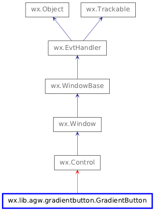
 Inheritance diagram for class GradientButton: