Navigation

- Home |
- Gallery |
- API Docs »
- wx.lib »
- wx.lib.agw »
- wx.lib.agw.labelbook »
- wx.lib.agw.labelbook.LabelContainer
- index
- modules |
- next |
- previous |
 wx.lib.agw.labelbook.LabelContainer
Base class for LabelBook.
 Methods Summary
Default class constructor. |
|
Allows the parent to examine the children type. Some implementation |
|
Draws a bitmap as the background of the control. |
|
Draws a label using the specified dc. |
|
Draws a rounded rectangle around the current tab. |
|
Draws a web style hover effect (cursor set to hand & text is underlined). |
|
Returns a colour for a parameter. |
|
Returns the width of the tab area. |
|
Initializes the colours map to be used for this control. |
|
Handles the |
|
Handles the |
|
Handles the |
|
Handles the |
|
Handles the |
|
Handles the |
|
Handles the |
|
Actually resizes the tab area. |
|
Sets the background bitmap for the control. |
|
Sets a colour for a parameter. |
|
Sets the width of the tab area. |
 Class API
LabelContainer(ImageContainerBase)¶Base class for LabelBook.
__init__(self, parent, id=wx.ID_ANY, pos=wx.DefaultPosition, size=wx.DefaultSize, style=0, agwStyle=0, name="LabelContainer")¶Default class constructor.
parent – parent window. Must not be None;
id – window identifier. A value of -1 indicates a default value;
pos – the control position. A value of (-1, -1) indicates a default position, chosen by either the windowing system or wxPython, depending on platform;
size – the control size. A value of (-1, -1) indicates a default size, chosen by either the windowing system or wxPython, depending on platform;
style – the underlying Panel window style;
agwStyle –
the AGW-specific window style. This can be a combination of the following bits:
Window Styles |
Hex Value |
Description |
|---|---|---|
|
0x1 |
Place labels below the page area. Available only for |
|
0x2 |
Place labels on the left side. Available only for |
|
0x4 |
Place labels on the right side. |
|
0x8 |
Place labels above the page area. |
|
0x10 |
Draws a border around |
|
0x20 |
Shows only text labels and no images. Available only for |
|
0x40 |
Shows only tab images and no label texts. Available only for |
|
0x80 |
Displays a pin button to show/hide the book control. |
|
0x100 |
Draw shadows below the book tabs. Available only for |
|
0x200 |
Displays a pin button to show/hide the book control. |
|
0x400 |
Draws a gradient shading on the tabs background. Available only for |
|
0x800 |
On mouse hovering, tabs behave like html hyperlinks. Available only for |
|
0x1000 |
Don’t allow resizing of the tab area. |
|
0x2000 |
Will fit the tab area to the longest text (or text+image if you have images) in all the tabs. |
|
0x4000 |
Show the selected tab text using a bold font. |
name – the window name.
CanDoBottomStyle(self)¶Allows the parent to examine the children type. Some implementation
(such as LabelBook), does not support top/bottom images, only left/right.
DrawBackgroundBitmap(self, dc)¶Draws a bitmap as the background of the control.
dc – an instance of wx.DC.
DrawLabel(self, dc, rect, text, bmp, imgInfo, orientationLeft, imgIdx, selected, hover)¶Draws a label using the specified dc.
dc – an instance of wx.DC;
rect – the text client rectangle;
text – the actual text string;
bmp – a bitmap to be drawn next to the text;
imgInfo – an instance of wx.ImageInfo;
orientationLeft – True if the book has the INB_RIGHT or INB_LEFT
style set;
imgIdx – the tab image index;
selected – True if the tab is selected, False otherwise;
hover – True if the tab is being hovered with the mouse, False otherwise.
DrawRegularHover(self, dc, rect)¶Draws a rounded rectangle around the current tab.
dc – an instance of wx.DC;
rect – the current tab client rectangle.
DrawWebHover(self, dc, caption, xCoord, yCoord, selected)¶Draws a web style hover effect (cursor set to hand & text is underlined).
dc – an instance of wx.DC;
caption – the tab caption text;
xCoord – the x position of the tab caption;
yCoord – the y position of the tab caption;
selected – True if the tab is selected, False otherwise.
GetColour(self, which)¶Returns a colour for a parameter.
which – the colour key.
See also
SetColour for a list of valid colour keys.
GetTabAreaWidth(self)¶Returns the width of the tab area.
InitializeColours(self)¶Initializes the colours map to be used for this control.
OnEraseBackground(self, event)¶Handles the wx.EVT_ERASE_BACKGROUND event for LabelContainer.
event – a EraseEvent event to be processed.
OnMouseLeaveWindow(self, event)¶Handles the wx.EVT_LEAVE_WINDOW event for LabelContainer.
event – a MouseEvent event to be processed.
OnMouseLeftDown(self, event)¶Handles the wx.EVT_LEFT_DOWN event for LabelContainer.
event – a MouseEvent event to be processed.
OnMouseLeftUp(self, event)¶Handles the wx.EVT_LEFT_UP event for LabelContainer.
event – a MouseEvent event to be processed.
OnMouseMove(self, event)¶Handles the wx.EVT_MOTION event for LabelContainer.
event – a MouseEvent event to be processed.
OnPaint(self, event)¶Handles the wx.EVT_PAINT event for LabelContainer.
event – a PaintEvent event to be processed.
OnSize(self, event)¶Handles the wx.EVT_SIZE event for LabelContainer.
event – a wx.SizeEvent event to be processed.
Resize(self, event)¶Actually resizes the tab area.
event – an instance of wx.SizeEvent.
SetBackgroundBitmap(self, bmp)¶Sets the background bitmap for the control.
bmp – a valid wx.Bitmap object.
SetColour(self, which, colour)¶Sets a colour for a parameter.
which – can be one of the following parameters:
Colour Key |
Value |
Description |
|---|---|---|
|
100 |
The tab area background colour |
|
101 |
The active tab background colour |
|
102 |
The tabs border colour |
|
103 |
The tab caption text colour |
|
104 |
The active tab caption text colour |
|
105 |
The tab caption highlight text colour |
colour – a valid wx.Colour object.
SetTabAreaWidth(self, width)¶Sets the width of the tab area.
width – the width of the tab area, in pixels.

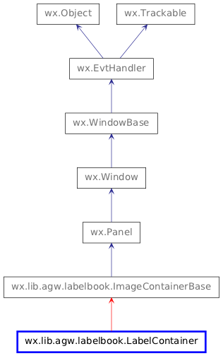
 Inheritance diagram for class LabelContainer: