 wx.ribbon.RibbonBar
Top-level control in a ribbon user interface.
Serves as a tabbed container for wx.ribbon.RibbonPage - a ribbon user interface typically has a ribbon bar, which contains one or more RibbonPages, which in turn each contain one or more RibbonPanels, which in turn contain controls.
While a wx.ribbon.RibbonBar has tabs similar to a wx.Notebook, it does not follow the same API for adding pages. Containers like wx.Notebook can contain any type of window as a page, hence the normal procedure is to create the sub-window and then call wx.BookCtrlBase.AddPage . As wx.ribbon.RibbonBar can only have wx.ribbon.RibbonPage as children (and a wx.ribbon.RibbonPage can only have a wx.ribbon.RibbonBar as parent), when a page is created, it is automatically added to the bar - there is no AddPage equivalent to call.
A ribbon bar can also show a Backstage from a “File” tab (see SetBackstagePage and SetBackstage).
After all pages have been created, and all controls and panels placed on those pages, Realize must be called.
KeyTips
Since wxWidgets 3.3.4, pressing WXK_F10 shows “KeyTips”: a badge over every element which has one, listing the letters to type to activate it. Unlike mnemonics, KeyTips are not derived from labels; an element only takes part if it was assigned one explicitly. See SetPageKeyTip, wx.ribbon.RibbonButtonBar.SetKeyTip and the other SetKeyTip() overloads. Multi-character KeyTips are supported; typing the first character narrows the badges down to the elements sharing it. A KeyTip must therefore not be a strict prefix of another visible at the same time, or it could never fire. This is not validated at run time. WXK_ESCAPE backs out one character, or leaves the mode if nothing was typed. Pressing the trigger key again, clicking the ribbon, or the frame being deactivated also leave it. CTRL and ALT combinations are treated as accelerators: the mode is left and the key passed on, so CTRL-S is not consumed by a button with KeyTip "S" . Activating a page tab is the one case which stays in the mode, showing the new page’s KeyTips. The trigger key is configurable, see SetKeyTipsTriggerKey. It is only consumed if there is something to show, so applications using no KeyTips keep their existing WXK_F10 handling.
Keyboard navigation
Since wxWidgets 3.3.4, the ribbon can be used with the keyboard. For the best results, put it in a wx.Panel (or other window supporting tab navigation) instead of directly in a wx.Frame. On the tabs, the arrow keys, WXK_HOME , and WXK_END switch the page, and WXK_RETURN , WXK_SPACE , or WXK_DOWN go into it. In the page, WXK_TAB and the arrow keys move between the items of the button bars, tool bars, galleries, and panels. WXK_RETURN or WXK_SPACE activate the current one, and WXK_ESCAPE goes back to the tabs.
Screen readers
 Window Styles
Since wxWidgets 3.3.4, the ribbon also reports itself to screen readers (wx``wx.USE_ACCESSIBILITY``), following the same keyboard model above: the tabs, pages, and the items within them are all exposed. This class supports the following styles:
wx.ribbon.RIBBON_BAR_DEFAULT_STYLE: Defined as wxRIBBON_BAR_FLOW_HORIZONTAL | ``wx.ribbon.RIBBON_BAR_SHOW_PAGE_LABELS` |wx.ribbon.RIBBON_BAR_SHOW_PANEL_EXT_BUTTONS|wx.ribbon.RIBBON_BAR_SHOW_TOGGLE_BUTTON|wx.ribbon.RIBBON_BAR_SHOW_HELP_BUTTON<span class=’style
<span class=’style
wx.ribbon.RIBBON_BAR_SHOW_PAGE_ICONS: Causes icons to be shown on the tabs in the ribbon bar.wx.ribbon.RIBBON_BAR_FLOW_HORIZONTAL: Causes panels within pages to stack horizontally.wx.ribbon.RIBBON_BAR_FLOW_VERTICAL: Causes panels within pages to stack vertically.wx.ribbon.RIBBON_BAR_SHOW_PANEL_EXT_BUTTONS: Causes extension buttons to be shown on panels (where the panel has such a button).wx.ribbon.RIBBON_BAR_SHOW_PANEL_MINIMISE_BUTTONS: Causes minimise buttons to be shown on panels (where the panel has such a button).wx.ribbon.RIBBON_BAR_SHOW_TOGGLE_BUTTON: Causes a toggle button to appear on the ribbon bar at top-right corner. This style is new since wxWidgets 2.9.5.wx.ribbon.RIBBON_BAR_SHOW_HELP_BUTTON: Causes a help button to appear on the ribbon bar at the top-right corner. This style is new since wxWidgets 2.9.5.
 Events Emitted by this Class
Handlers bound for the following event types will receive one of the wx.ribbon.RibbonBarEvent parameters.
EVT_RIBBONBAR_PAGE_CHANGED: Triggered after the transition from one page being active to a different page being active.
EVT_RIBBONBAR_PAGE_CHANGING: Triggered prior to the transition from one page being active to a different page being active, and can veto the change.
EVT_RIBBONBAR_TAB_MIDDLE_DOWN: Triggered when the middle mouse button is pressed on a tab.
EVT_RIBBONBAR_TAB_MIDDLE_UP: Triggered when the middle mouse button is released on a tab.
EVT_RIBBONBAR_TAB_RIGHT_DOWN: Triggered when the right mouse button is pressed on a tab.
EVT_RIBBONBAR_TAB_RIGHT_UP: Triggered when the right mouse button is released on a tab.
EVT_RIBBONBAR_TAB_LEFT_DCLICK: Triggered when the left mouse button is double clicked on a tab.
EVT_RIBBONBAR_TOGGLED: Triggered when the button triggering the ribbon bar is clicked. This event is new since wxWidgets 2.9.5.
EVT_RIBBONBAR_HELP_CLICK: Triggered when the help button is clicked. This even is new since wxWidgets 2.9.5.
See also
See also
 Class Hierarchy
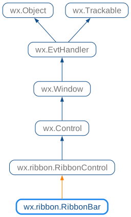
 Control Appearance


 Methods Summary
Default constructor. |
|
Adds another key which shows KeyTips, keeping the existing ones. |
|
Highlight the specified tab. |
|
Returns |
|
Indicates whether the panel area of the ribbon bar is shown. |
|
Removes all trigger keys, disabling keyboard access mode. |
|
Delete all pages from the ribbon bar. |
|
Create a ribbon bar in two-step ribbon bar construction. |
|
Delete a single page from this ribbon bar. |
|
Dismiss the expanded panel of the currently active page. |
|
Get the index of the active page. |
|
Returns the page that acts as the File tab, or nullptr if there is none. |
|
Returns the colour of the File tab when it is styled. |
|
Return the image list containing images of the given size, creating it if necessary. |
|
Returns the current display mode of the panel area. |
|
Returns the keys which show KeyTips. |
|
Get a page by index. |
|
Get a page by window |
|
Get the number of pages in this bar. |
|
Returns the number for a given ribbon bar page. |
|
Returns whether the bar contains multiple pages. |
|
Hide the panels if its display mode is |
|
Leaves keyboard access mode and hides the KeyTip badges. |
|
Hides the tab for a given page. |
|
Hides the panel area of the ribbon bar. |
|
Returns |
|
Returns |
|
Indicates whether a tab is currently highlighted. |
|
Indicates whether the tab for the given page is shown to the user or not. |
|
Perform initial layout and size calculations of the bar and its children. |
|
Changes a tab to not be highlighted. |
|
Set the active page by index, without triggering any events. |
|
Set the art provider to be used be the ribbon bar. |
|
Sets the page that acts as the “File” tab of the backstage. |
|
Sets the colour of the File tab when it is styled. |
|
Assigns the KeyTip used to activate the help button. |
|
Makes keyCode with modifiers the only key which shows KeyTips. |
|
Assigns the KeyTip used to switch to the given page. |
|
Set the margin widths (in pixels) on the left and right sides of the tab bar region of the ribbon bar. |
|
Assigns the KeyTip used to activate the panel toggle button. |
|
Shows or hides the backstage. |
|
Enters keyboard access mode and shows the KeyTip badges. |
|
Show or hide the tab for a given page. |
|
Shows or hide the panel area of the ribbon bar according to the given display mode. |
|
Sets whether the File tab is drawn in an accent colour. |
|
Applies the art provider’s colours to the backstage. |
 Properties Summary
See |
|
See |
|
See |
|
See |
 Class API
- class wx.ribbon.RibbonBar(RibbonControl)
Possible constructors:
RibbonBar() -> None

RibbonBar(parent, id=ID_ANY, pos=DefaultPosition, size=DefaultSize,
          style=RIBBON_BAR_DEFAULT_STYLE) -> None
Top-level control in a ribbon user interface.
Methods
- __init__(self, *args, **kw)
 Overloaded Implementations:
__init__ (self)
Default constructor.
With this constructor,
Createshould be called in order to create the ribbon bar.- Return type:
None
__init__ (self, parent, id=ID_ANY, pos=DefaultPosition, size=DefaultSize, style=RIBBON_BAR_DEFAULT_STYLE)
Construct a ribbon bar with the given parameters.
- Parameters:
- Return type:
None
- AddKeyTipsTriggerKey(self, keyCode, modifiers=MOD_NONE)
Adds another key which shows KeyTips, keeping the existing ones.
- Parameters:
keyCode (int)
modifiers (int)
- Return type:
None
Added in version 4.3/wxWidgets-3.3.4.
- AddPageHighlight(self, page, highlight=True)
Highlight the specified tab.
Highlighted tabs have a colour between that of the active tab and a tab over which the mouse is hovering. This can be used to make a tab (usually temporarily) more noticeable to the user.
- Parameters:
page (int)
highlight (bool)
- Return type:
None
Added in version 2.9.5.
- AreKeyTipsShown(self)
Returns
Trueif keyboard access mode is currently active.- Return type:
bool
Added in version 4.3/wxWidgets-3.3.4.
- ArePanelsShown(self)
Indicates whether the panel area of the ribbon bar is shown.
- Return type:
bool
Added in version 2.9.2.
See also
- ClearKeyTipsTriggerKeys(self)
Removes all trigger keys, disabling keyboard access mode.
It can still be entered programmatically with
ShowKeyTips.- Return type:
None
Added in version 4.3/wxWidgets-3.3.4.
- ClearPages(self)
Delete all pages from the ribbon bar.
- Return type:
None
Added in version 2.9.4.
- Create(self, parent, id=ID_ANY, pos=DefaultPosition, size=DefaultSize, style=RIBBON_BAR_DEFAULT_STYLE)
Create a ribbon bar in two-step ribbon bar construction.
Should only be called when the default constructor is used, and arguments have the same meaning as in the full constructor.
- DeletePage(self, n)
Delete a single page from this ribbon bar.
The user must call
wx.ribbon.RibbonBar.Realizeafter one (or more) calls to this function.- Parameters:
n (int)
- Return type:
None
Added in version 2.9.4.
- DismissExpandedPanel(self)
Dismiss the expanded panel of the currently active page.
Calls and returns the value from
wx.ribbon.RibbonPage.DismissExpandedPanelfor the currently active page, orFalseif there is no active page.- Return type:
bool
- GetActivePage(self)
Get the index of the active page.
In the rare case of no page being active, -1 is returned.
- Return type:
int
- GetBackstagePage(self)
Returns the page that acts as the File tab, or nullptr if there is none.
- Return type:
Added in version 4.3/wxWidgets-3.3.4.
- GetBackstageTabColour(self)
Returns the colour of the File tab when it is styled.
- Return type:
Colour
Added in version 4.3/wxWidgets-3.3.4.
- GetButtonImageList(self, size, initialCount=1)
Return the image list containing images of the given size, creating it if necessary.
- Parameters:
size (wx.Size) – The size of the images going into this image list.
initialCount (int) – The initial number of images to reserve for the image list (this parameter is available since wxWidgets 3.3.2).
- Return type:
ImageList
- Returns:
The existing (or newly created) image list.
Added in version 4.1/wxWidgets-3.1.4.
- static GetClassDefaultAttributes(variant=WINDOW_VARIANT_NORMAL)
- Parameters:
variant (WindowVariant)
- Return type:
VisualAttributes
- GetDisplayMode(self)
Returns the current display mode of the panel area.
- Return type:
Added in version 4.1/wxWidgets-3.1.0.
See also
- GetKeyTipsTriggerKeys(self)
Returns the keys which show KeyTips.
- Return type:
List[RibbonBar.TriggerKey]
Added in version 4.3/wxWidgets-3.3.4.
- GetPage(self, n)
Get a page by index.
nullptr will be returned if the given index is out of range.
- Parameters:
n (int)
- Return type:
- GetPageById(self, id)
Get a page by window
ID.nullptr will be returned if no page with the
IDis found.- Parameters:
id (wx.WindowID)
- Return type:
Added in version 4.3/wxWidgets-3.3.0.
- GetPageCount(self)
Get the number of pages in this bar.
- Return type:
int
Added in version 2.9.4.
- GetPageNumber(self, page)
Returns the number for a given ribbon bar page.
The number can be used in other ribbon bar calls.
- Parameters:
page (wx.ribbon.RibbonPage)
- Return type:
int
Added in version 2.9.5.
- HasMultiplePages(self)
Returns whether the bar contains multiple pages.
The default implementation always returns
true.- Return type:
bool
- HideIfExpanded(self)
Hide the panels if its display mode is
RIBBON_BAR_EXPANDED.- Return type:
None
Added in version 2.9.5.
- HideKeyTips(self)
Leaves keyboard access mode and hides the KeyTip badges.
Does nothing if the mode isn’t active.
- Return type:
None
Added in version 4.3/wxWidgets-3.3.4.
- HidePage(self, page)
Hides the tab for a given page.
Equivalent to
ShowPage(page, false).- Parameters:
page (int)
- Return type:
None
Added in version 2.9.5.
- HidePanels(self)
Hides the panel area of the ribbon bar.
This method behaves like
ShowPanelswithFalseargument.- Return type:
None
Added in version 2.9.2.
- IsBackstageShown(self)
Returns
Trueif the backstage is currently shown.- Return type:
bool
Added in version 4.3/wxWidgets-3.3.4.
- IsBackstageTabStyled(self)
Returns
Trueif the File tab is drawn in an accent colour.- Return type:
bool
Added in version 4.3/wxWidgets-3.3.4.
See also
- IsPageHighlighted(self, page)
Indicates whether a tab is currently highlighted.
- Parameters:
page (int)
- Return type:
bool
Added in version 2.9.5.
See also
- IsPageShown(self, page)
Indicates whether the tab for the given page is shown to the user or not.
By default all page tabs are shown.
- Parameters:
page (int)
- Return type:
bool
Added in version 2.9.5.
- Realize(self)
Perform initial layout and size calculations of the bar and its children.
This must be called after all of the bar’s children have been created (and their children created, etc.) - if it is not, then windows may not be laid out or sized correctly.
Also calls
wx.ribbon.RibbonPage.Realizeon each child page.- Return type:
bool
- RemovePageHighlight(self, page)
Changes a tab to not be highlighted.
- Parameters:
page (int)
- Return type:
None
Added in version 2.9.5.
See also
- SetActivePage(self, *args, **kw)
- Overloaded Implementations:
SetActivePage (self, page)
Set the active page by index, without triggering any events.
- Parameters:
page (int) – The zero-based index of the page to activate.
- Return type:
bool
- Returns:
Trueif the specified page is now active,Falseif it could not be activated (for example because the page index is invalid).
SetActivePage (self, page)
Set the active page, without triggering any events.
- Parameters:
page (wx.ribbon.RibbonPage) – The page to activate.
- Return type:
bool
- Returns:
Trueif the specified page is now active,Falseif it could not be activated (for example because the given page is not a child of the ribbon bar).
- SetArtProvider(self, art)
Set the art provider to be used be the ribbon bar.
Also sets the art provider on all current wx.ribbon.RibbonPage children, and any wx.ribbon.RibbonPage children added in the future.
Note that unlike most other ribbon controls, the ribbon bar creates a default art provider when initialised, so an explicit call to
SetArtProvideris not required if the default art provider is sufficient. Also, unlike other ribbon controls, the ribbon bar takes ownership of the given pointer, and will delete it when the art provider is changed or the bar is destroyed. If this behaviour is not desired, then clone the art provider before setting it.- Parameters:
- Return type:
None
- SetBackstagePage(self, page)
Sets the page that acts as the “File” tab of the backstage.
The page should not contain any panels. Only one page can be the File tab at a time. (Setting another one turns the previous page back into an ordinary tab.) If the backstage is currently shown, it is shown again from the new tab.
The File tab is drawn in the system’s accent colour (see
StyleBackstageTabandSetBackstageTabColour).- Parameters:
page (wx.ribbon.RibbonPage) – The File tab’s page, or nullptr to disable the backstage.
- Return type:
None
Added in version 4.3/wxWidgets-3.3.4.
See also
SetBackstage,ShowBackstage
- SetBackstageTabColour(self, colour)
Sets the colour of the File tab when it is styled.
- Parameters:
colour (wx.Colour) – The colour, or an invalid colour to use the system’s accent colour (the default).
- Return type:
None
Added in version 4.3/wxWidgets-3.3.4.
- SetHelpButtonKeyTip(self, keytip)
Assigns the KeyTip used to activate the help button.
Only has an effect if the bar uses
RIBBON_BAR_SHOW_HELP_BUTTON.- Parameters:
keytip (string)
- Return type:
None
Added in version 4.3/wxWidgets-3.3.4.
- SetKeyTipsTriggerKey(self, keyCode, modifiers=MOD_NONE)
Makes keyCode with modifiers the only key which shows KeyTips.
Replaces the default of
WXK_F10with no modifiers.- Parameters:
keyCode (int)
modifiers (int)
- Return type:
None
Added in version 4.3/wxWidgets-3.3.4.
See also
- SetPageKeyTip(self, *args, **kw)
- Overloaded Implementations:
SetPageKeyTip (self, page, keytip)
Assigns the KeyTip used to switch to the given page.
Pass an empty string to remove it. The KeyTip is stored uppercased.
- Parameters:
page (int)
keytip (string)
- Return type:
None
Added in version 4.3/wxWidgets-3.3.4.
See also
KeyTips
SetPageKeyTip (self, page, keytip)
This is an overloaded member function, provided for convenience. It differs from the above function only in what argument(s) it accepts.
- Parameters:
page (wx.ribbon.RibbonPage)
keytip (string)
- Return type:
None
Added in version 4.3/wxWidgets-3.3.4.
- SetTabCtrlMargins(self, left, right)
Set the margin widths (in pixels) on the left and right sides of the tab bar region of the ribbon bar.
These margins will be painted with the tab background, but tabs and scroll buttons will never be painted in the margins.
The left margin could be used for rendering something equivalent to the “Office Button”, though this is not currently implemented. The right margin could be used for rendering a help button, and/or MDI buttons, but again, this is not currently implemented.
- Parameters:
left (int)
right (int)
- Return type:
None
- SetToggleButtonKeyTip(self, keytip)
Assigns the KeyTip used to activate the panel toggle button.
Only has an effect if the bar uses
RIBBON_BAR_SHOW_TOGGLE_BUTTON.- Parameters:
keytip (string)
- Return type:
None
Added in version 4.3/wxWidgets-3.3.4.
- ShowBackstage(self, show=True)
Shows or hides the backstage.
Showing the backstage selects the File tab, collapses the panels, and swaps the content for the backstage. Hiding it selects the first other tab (if the File tab was selected), restores the display mode that the ribbon had, and brings back the content.
Selecting the File tab or any other tab with the mouse or keyboard does this automatically. As the ribbon bar does not send a page changed event when a page is selected from code, use this function to show or hide the backstage programmatically.
While the backstage is shown, the toggle button and double-clicking the File tab do nothing, and no
wxEVT_RIBBONBAR_TOGGLEDevent is sent.- Parameters:
show (bool)
- Return type:
None
Added in version 4.3/wxWidgets-3.3.4.
See also
- ShowKeyTips(self)
Enters keyboard access mode and shows the KeyTip badges.
- Return type:
bool
- Returns:
Trueif the mode was entered,Falseif the bar isn’t shown on screen or no KeyTips are currently assigned to anything visible.
Added in version 4.3/wxWidgets-3.3.4.
See also
KeyTips
- ShowPage(self, page, show_tab=True)
Show or hide the tab for a given page.
After showing or hiding a tab, you need to call
wx.ribbon.RibbonBar.Realize. If you hide the tab for the currently active page (GetActivePage) then you should call SetActivePage to activate a different page.- Parameters:
page (int)
show_tab (bool)
- Return type:
None
Added in version 2.9.5.
- ShowPanels(self, *args, **kw)
- Overloaded Implementations:
ShowPanels (self, mode)
Shows or hide the panel area of the ribbon bar according to the given display mode.
- Parameters:
mode (RibbonDisplayMode)
- Return type:
None
Added in version 4.1/wxWidgets-3.1.0.
ShowPanels (self, show=True)
Shows or hides the panel area of the ribbon bar.
If the panel area is hidden, then only the tab of the ribbon bar will be shown. This is useful for giving the user more screen space to work with when he/she doesn’t need to see the ribbon’s options.
If the panel is currently shown, this method pins it, use the other overload of this method to specify the exact panel display mode to avoid it.
- Parameters:
show (bool)
- Return type:
None
Added in version 2.9.2.
- StyleBackstageTab(self, style=True)
Sets whether the File tab is drawn in an accent colour.
If
True(the default), the File tab is filled with the colour given byGetBackstageTabColourand its label is drawn in a contrasting colour. The fill has a glossy sheen, unless the art provider is RibbonMSWFlatArtProvider , in which case it is flat. IfFalse, the File tab is drawn like any other tab.- Parameters:
style (bool)
- Return type:
None
Added in version 4.3/wxWidgets-3.3.4.
- UpdateBackstageColours(self)
Applies the art provider’s colours to the backstage.
This is done automatically when the backstage or art provider is changed, and when the system colours change. Call it if the art provider’s colours were changed afterwards.
- Return type:
None
Added in version 4.3/wxWidgets-3.3.4.
Properties
- ActivePage
See
GetActivePageandSetActivePage
- BackstagePage
See
GetBackstagePageandSetBackstagePage
- BackstageTabColour
- DisplayMode
See
GetDisplayMode
- KeyTipsTriggerKeys
- PageCount
See
GetPageCount