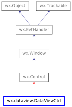
wx.dataview.DataViewCtrl
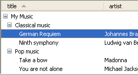
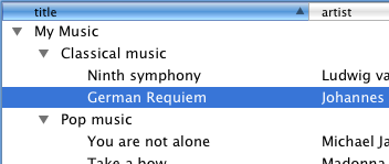
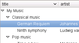
wx.dataview.DataViewCtrl is a control to display data either in a tree like fashion or in a tabular form or both.
If you only need to display a simple tree structure with an API more like the older wx.TreeCtrl class, then the specialized wx.dataview.DataViewTreeCtrl can be used. Likewise, if you only want to display simple table structure you can use the specialized wx.dataview.DataViewListCtrl class. Both wx.dataview.DataViewTreeCtrl and wx.dataview.DataViewListCtrl can be used without defining your own wx.dataview.DataViewModel.
A wx.dataview.DataViewItem is used to represent a (visible) item in the control.
Unlike wx.ListCtrl, wx.dataview.DataViewCtrl doesn’t get its data from the user through virtual functions or by setting it directly. Instead you need to write your own wx.dataview.DataViewModel and associate it with this control. Then you need to add a number of wx.dataview.DataViewColumn to this control to define what each column shall display. Each wx.dataview.DataViewColumn in turn owns 1 instance of a wx.dataview.DataViewRenderer to render its cells.
A number of standard renderers for rendering text, dates, images, toggle, a progress bar etc. are provided. Additionally, the user can write custom renderers deriving from wx.dataview.DataViewCustomRenderer for displaying anything.
All data transfer from the control to the model and the user code is done through Variant which can be extended to support more data formats as necessary. Accordingly, all type information uses the strings returned from Variant.GetType .
 Window Styles
This class supports the following styles:
wx.dataview.DV_SINGLE: Single selection mode. This is the default.
wx.dataview.DV_MULTIPLE: Multiple selection mode.
wx.dataview.DV_ROW_LINES: Use alternating colours for rows if supported by platform and theme. Currently only supported by the native GTK and OS X implementations but not by the generic one.
wx.dataview.DV_HORIZ_RULES: Display the separator lines between rows.
wx.dataview.DV_VERT_RULES: Display the separator lines between columns.
wx.dataview.DV_VARIABLE_LINE_HEIGHT: Allow variable line heights. This can be inefficient when displaying large number of items.
wx.dataview.DV_NO_HEADER: Do not show column headers (which are shown by default).
 Events Emitted by this Class
Handlers bound for the following event types will receive a wx.dataview.DataViewEvent parameter.
EVT_DATAVIEW_SELECTION_CHANGED: Process a wxEVT_DATAVIEW_SELECTION_CHANGED event.
EVT_DATAVIEW_ITEM_ACTIVATED: Process a wxEVT_DATAVIEW_ITEM_ACTIVATED event. This event is triggered by double clicking an item or pressing some special key (usually “Enter”) when it is focused.
EVT_DATAVIEW_ITEM_START_EDITING: Process a wxEVT_DATAVIEW_ITEM_START_EDITING event. This event can be vetoed in order to prevent editing on an item by item basis.
EVT_DATAVIEW_ITEM_EDITING_STARTED: Process a wxEVT_DATAVIEW_ITEM_EDITING_STARTED event.
EVT_DATAVIEW_ITEM_EDITING_DONE: Process a wxEVT_DATAVIEW_ITEM_EDITING_DONE event.
EVT_DATAVIEW_ITEM_COLLAPSING: Process a wxEVT_DATAVIEW_ITEM_COLLAPSING event.
EVT_DATAVIEW_ITEM_COLLAPSED: Process a wxEVT_DATAVIEW_ITEM_COLLAPSED event.
EVT_DATAVIEW_ITEM_EXPANDING: Process a wxEVT_DATAVIEW_ITEM_EXPANDING event.
EVT_DATAVIEW_ITEM_EXPANDED: Process a wxEVT_DATAVIEW_ITEM_EXPANDED event.
EVT_DATAVIEW_ITEM_VALUE_CHANGED: Process a wxEVT_DATAVIEW_ITEM_VALUE_CHANGED event.
EVT_DATAVIEW_ITEM_CONTEXT_MENU: Process a wxEVT_DATAVIEW_ITEM_CONTEXT_MENU event generated when the user right clicks inside the control. Notice that this menu is generated even if the click didn’t occur on any valid item, in this case wx.dataview.DataViewEvent.GetItem simply returns an invalid item.
EVT_DATAVIEW_COLUMN_HEADER_CLICK: Process a wxEVT_DATAVIEW_COLUMN_HEADER_CLICK event.
EVT_DATAVIEW_COLUMN_HEADER_RIGHT_CLICK: Process a wxEVT_DATAVIEW_COLUMN_HEADER_RIGHT_CLICK event. Notice that currently this event is not generated in the native OS X versions of the control.
EVT_DATAVIEW_COLUMN_SORTED: Process a wxEVT_DATAVIEW_COLUMN_SORTED event.
EVT_DATAVIEW_COLUMN_REORDERED: Process a wxEVT_DATAVIEW_COLUMN_REORDERED event.
EVT_DATAVIEW_ITEM_BEGIN_DRAG: Process a wxEVT_DATAVIEW_ITEM_BEGIN_DRAG event.
EVT_DATAVIEW_ITEM_DROP_POSSIBLE: Process a wxEVT_DATAVIEW_ITEM_DROP_POSSIBLE event.
EVT_DATAVIEW_ITEM_DROP: Process a wxEVT_DATAVIEW_ITEM_DROP event.
wxEVT_LEFT_DOWN in all ports (notably it doesn’t work in wxGTK). If you need to handle any mouse events not covered by the ones above, consider using a custom renderer for the cells that must handle them.
 Methods Summary
Default Constructor. |
|
Appends a column for rendering a bitmap. |
|
Appends a wx.dataview.DataViewColumn to the control. |
|
Appends a column for rendering a date. |
|
Appends a column for rendering text with an icon. |
|
Appends a column for rendering a progress indicator. |
|
Appends a column for rendering text. |
|
Appends a column for rendering a toggle. |
|
Associates a wx.dataview.DataViewModel with the control. |
|
Associates a |
|
Removes all columns. |
|
Collapses the item. |
|
Create the control. |
|
Deletes given column. |
|
Programmatically starts editing given cell of item. |
|
Enable drag operations using the given format. |
|
Enable drop operations using the given format. |
|
Call this to ensure that the given item is visible. |
|
Expands the item. |
|
Expands all ancestors of the item. |
|
Returns pointer to the column. |
|
Returns the number of columns. |
|
Returns the position of the column or -1 if not found in the control. |
|
Returns a list of column objects. |
|
Returns the column that currently has focus. |
|
Returns the currently focused item. |
|
Returns column containing the expanders. |
|
Returns indentation. |
|
Returns item rectangle. |
|
Returns pointer to the data model associated with the control (if any). |
|
Returns the number of currently selected items. |
|
Returns first selected item or an invalid item if none is selected. |
|
Returns a list of the currently selected items. |
|
Returns the wx.dataview.DataViewColumn currently responsible for sorting or |
|
Returns |
|
HitTest(point) . (item, col) |
|
Inserts a wx.dataview.DataViewColumn to the control. |
|
Return |
|
Return |
|
Prepends a column for rendering a bitmap. |
|
Prepends a wx.dataview.DataViewColumn to the control. |
|
Prepends a column for rendering a date. |
|
Prepends a column for rendering text with an icon. |
|
Prepends a column for rendering a progress indicator. |
|
Prepends a column for rendering text. |
|
Prepends a column for rendering a toggle. |
|
Select the given item. |
|
Select all items. |
|
Changes the currently focused item. |
|
Set which column shall contain the tree-like expanders. |
|
Sets the indentation. |
|
Sets the row height. |
|
Sets the selection to the array of DataViewItems. |
|
Unselect the given item. |
|
Unselect all item. |
 Properties Summary
See |
|
See |
|
See |
|
See |
|
See |
|
See |
|
See |
|
See |
|
See |
 Class API
wx.dataview.DataViewCtrl(Control)¶Possible constructors:
DataViewCtrl()

DataViewCtrl(parent, id=ID_ANY, pos=DefaultPosition, size=DefaultSize,
             style=0, validator=DefaultValidator, name=DataViewCtrlNameStr)
DataViewCtrl is a control to display data either in a tree like fashion or in a tabular form or both.
__init__(self, *args, **kw)¶ Overloaded Implementations:
__init__ (self)
Default Constructor.
__init__ (self, parent, id=ID_ANY, pos=DefaultPosition, size=DefaultSize, style=0, validator=DefaultValidator, name=DataViewCtrlNameStr)
Constructor.
Calls Create .
parent (wx.Window) –
id (wx.WindowID) –
pos (wx.Point) –
size (wx.Size) –
style (long) –
validator (wx.Validator) –
name (string) –
AppendBitmapColumn(self, *args, **kw)¶Appends a column for rendering a bitmap.
Returns the wx.dataview.DataViewColumn created in the function or None on failure.
Overloaded Implementations:
AppendBitmapColumn (self, label, model_column, mode=DATAVIEW_CELL_INERT, width=-1, align=ALIGN_CENTER, flags=DATAVIEW_COL_RESIZABLE)
label (string) –
model_column (int) –
mode (DataViewCellMode) –
width (int) –
align (Alignment) –
flags (int) –
AppendBitmapColumn (self, label, model_column, mode=DATAVIEW_CELL_INERT, width=-1, align=ALIGN_CENTER, flags=DATAVIEW_COL_RESIZABLE)
label (wx.Bitmap) –
model_column (int) –
mode (DataViewCellMode) –
width (int) –
align (Alignment) –
flags (int) –
AppendColumn(self, col)¶Appends a wx.dataview.DataViewColumn to the control.
Returns True on success.
Note that there is a number of short cut methods which implicitly create a wx.dataview.DataViewColumn and a wx.dataview.DataViewRenderer for it (see below).
col (wx.dataview.DataViewColumn) –
bool
AppendDateColumn(self, *args, **kw)¶Appends a column for rendering a date.
Returns the wx.dataview.DataViewColumn created in the function or None on failure.
Note
The align parameter is applied to both the column header and the column renderer.
Overloaded Implementations:
AppendDateColumn (self, label, model_column, mode=DATAVIEW_CELL_ACTIVATABLE, width=-1, align=ALIGN_NOT, flags=DATAVIEW_COL_RESIZABLE)
label (string) –
model_column (int) –
mode (DataViewCellMode) –
width (int) –
align (Alignment) –
flags (int) –
AppendDateColumn (self, label, model_column, mode=DATAVIEW_CELL_ACTIVATABLE, width=-1, align=ALIGN_NOT, flags=DATAVIEW_COL_RESIZABLE)
label (wx.Bitmap) –
model_column (int) –
mode (DataViewCellMode) –
width (int) –
align (Alignment) –
flags (int) –
AppendIconTextColumn(self, *args, **kw)¶Appends a column for rendering text with an icon.
Returns the wx.dataview.DataViewColumn created in the function or None on failure. This method uses the wx.dataview.DataViewIconTextRenderer class.
Note
The align parameter is applied to both the column header and the column renderer.
Overloaded Implementations:
AppendIconTextColumn (self, label, model_column, mode=DATAVIEW_CELL_INERT, width=-1, align=ALIGN_NOT, flags=DATAVIEW_COL_RESIZABLE)
label (string) –
model_column (int) –
mode (DataViewCellMode) –
width (int) –
align (Alignment) –
flags (int) –
AppendIconTextColumn (self, label, model_column, mode=DATAVIEW_CELL_INERT, width=-1, align=ALIGN_NOT, flags=DATAVIEW_COL_RESIZABLE)
label (wx.Bitmap) –
model_column (int) –
mode (DataViewCellMode) –
width (int) –
align (Alignment) –
flags (int) –
AppendProgressColumn(self, *args, **kw)¶Appends a column for rendering a progress indicator.
Returns the wx.dataview.DataViewColumn created in the function or None on failure.
Note
The align parameter is applied to both the column header and the column renderer.
Overloaded Implementations:
AppendProgressColumn (self, label, model_column, mode=DATAVIEW_CELL_INERT, width=80, align=ALIGN_CENTER, flags=DATAVIEW_COL_RESIZABLE)
label (string) –
model_column (int) –
mode (DataViewCellMode) –
width (int) –
align (Alignment) –
flags (int) –
AppendProgressColumn (self, label, model_column, mode=DATAVIEW_CELL_INERT, width=80, align=ALIGN_CENTER, flags=DATAVIEW_COL_RESIZABLE)
label (wx.Bitmap) –
model_column (int) –
mode (DataViewCellMode) –
width (int) –
align (Alignment) –
flags (int) –
AppendTextColumn(self, *args, **kw)¶Appends a column for rendering text.
Returns the wx.dataview.DataViewColumn created in the function or None on failure.
Note
The align parameter is applied to both the column header and the column renderer.
Overloaded Implementations:
AppendTextColumn (self, label, model_column, mode=DATAVIEW_CELL_INERT, width=-1, align=ALIGN_NOT, flags=DATAVIEW_COL_RESIZABLE)
label (string) –
model_column (int) –
mode (DataViewCellMode) –
width (int) –
align (Alignment) –
flags (int) –
AppendTextColumn (self, label, model_column, mode=DATAVIEW_CELL_INERT, width=-1, align=ALIGN_NOT, flags=DATAVIEW_COL_RESIZABLE)
label (wx.Bitmap) –
model_column (int) –
mode (DataViewCellMode) –
width (int) –
align (Alignment) –
flags (int) –
AppendToggleColumn(self, *args, **kw)¶Appends a column for rendering a toggle.
Returns the wx.dataview.DataViewColumn created in the function or None on failure.
Note
The align parameter is applied to both the column header and the column renderer.
Overloaded Implementations:
AppendToggleColumn (self, label, model_column, mode=DATAVIEW_CELL_INERT, width=30, align=ALIGN_CENTER, flags=DATAVIEW_COL_RESIZABLE)
label (string) –
model_column (int) –
mode (DataViewCellMode) –
width (int) –
align (Alignment) –
flags (int) –
AppendToggleColumn (self, label, model_column, mode=DATAVIEW_CELL_INERT, width=30, align=ALIGN_CENTER, flags=DATAVIEW_COL_RESIZABLE)
label (wx.Bitmap) –
model_column (int) –
mode (DataViewCellMode) –
width (int) –
align (Alignment) –
flags (int) –
_AssociateModel(self, model)¶Associates a wx.dataview.DataViewModel with the control.
This increases the reference count of the model by 1.
model (wx.dataview.DataViewModel) –
bool
AssociateModel(self, model)¶Associates a DataViewModel with the control.
Ownership of the model object is passed to C++, however it
is reference counted so it can be shared with other views.
ClearColumns(self)¶Removes all columns.
bool
Collapse(self, item)¶Collapses the item.
item (wx.dataview.DataViewItem) –
Create(self, parent, id=ID_ANY, pos=DefaultPosition, size=DefaultSize, style=0, validator=DefaultValidator, name=DataViewCtrlNameStr)¶Create the control.
Useful for two step creation.
parent (wx.Window) –
id (wx.WindowID) –
pos (wx.Point) –
size (wx.Size) –
style (long) –
validator (wx.Validator) –
name (string) –
bool
DeleteColumn(self, column)¶Deletes given column.
column (wx.dataview.DataViewColumn) –
bool
EditItem(self, item, column)¶Programmatically starts editing given cell of item.
Doesn’t do anything if the item or this column is not editable.
item (wx.dataview.DataViewItem) –
column (wx.dataview.DataViewColumn) –
New in version 2.9.4.
Note
Currently not implemented in OSX/Carbon.
EnableDragSource(self, format)¶Enable drag operations using the given format.
format (wx.DataFormat) –
bool
EnableDropTarget(self, format)¶Enable drop operations using the given format.
format (wx.DataFormat) –
bool
EnsureVisible(self, item, column=None)¶Call this to ensure that the given item is visible.
item (wx.dataview.DataViewItem) –
column (wx.dataview.DataViewColumn) –
Expand(self, item)¶Expands the item.
item (wx.dataview.DataViewItem) –
ExpandAncestors(self, item)¶Expands all ancestors of the item.
This method also ensures that the item itself as well as all ancestor items have been read from the model by the control.
item (wx.dataview.DataViewItem) –
GetClassDefaultAttributes(variant=WINDOW_VARIANT_NORMAL)¶variant (WindowVariant) –
VisualAttributes
GetColumn(self, pos)¶Returns pointer to the column.
pos refers to the position in the control which may change after reordering columns by the user.
pos (int) –
GetColumnCount(self)¶Returns the number of columns.
int
GetColumnPosition(self, column)¶Returns the position of the column or -1 if not found in the control.
column (wx.dataview.DataViewColumn) –
int
GetColumns(self)¶Returns a list of column objects.
GetCurrentColumn(self)¶Returns the column that currently has focus.
If the focus is set to individual cell within the currently focused item (as opposed to being on the item as a whole), then this is the column that the focus is on.
Returns None if no column currently has focus.
New in version 2.9.4.
See also
GetCurrentItem(self)¶Returns the currently focused item.
This is the item that the keyboard commands apply to. It may be invalid if there is no focus currently.
This method is mostly useful for the controls with DV_MULTIPLE style as in the case of single selection it returns the same thing as GetSelection .
Notice that under all platforms except Mac OS X the currently focused item may be selected or not but under OS X the current item is always selected.
New in version 2.9.2.
See also
GetExpanderColumn(self)¶Returns column containing the expanders.
GetIndent(self)¶Returns indentation.
int
GetItemRect(self, item, col=None)¶Returns item rectangle.
This method is currently not implemented at all in wxGTK and only implemented for not None col argument in wxOSX. It is fully implemented in the generic version of the control.
item (wx.dataview.DataViewItem) – A valid item.
col (wx.dataview.DataViewColumn) – If not None, the rectangle returned corresponds to the intersection of the item with the specified column. If None, the rectangle spans all the columns.
Rect
GetModel(self)¶Returns pointer to the data model associated with the control (if any).
GetSelectedItemsCount(self)¶Returns the number of currently selected items.
This method may be called for both the controls with single and multiple selections and returns the number of selected item, possibly 0, in any case.
int
New in version 2.9.3.
GetSelection(self)¶Returns first selected item or an invalid item if none is selected.
This method may be called for both the controls with single and multiple selections but returns an invalid item if more than one item is selected in the latter case, use HasSelection to determine if there are any selected items when using multiple selection.
GetSelections(self)¶Returns a list of the currently selected items.
DataViewItemArray
GetSortingColumn(self)¶Returns the wx.dataview.DataViewColumn currently responsible for sorting or None if none has been selected.
HasSelection(self)¶Returns True if any items are currently selected.
This method may be called for both the controls with single and multiple selections.
Calling this method is equivalent to calling GetSelectedItemsCount and comparing its result with 0 but is more clear and might also be implemented more efficiently in the future.
bool
New in version 2.9.3.
HitTest(self, point)¶HitTest(point) . (item, col)
Returns the item and column located at point, as a 2 element tuple.
PyObject
InsertColumn(self, pos, col)¶Inserts a wx.dataview.DataViewColumn to the control.
Returns True on success.
pos (int) –
col (wx.dataview.DataViewColumn) –
bool
IsExpanded(self, item)¶Return True if the item is expanded.
item (wx.dataview.DataViewItem) –
bool
IsSelected(self, item)¶Return True if the item is selected.
item (wx.dataview.DataViewItem) –
bool
PrependBitmapColumn(self, *args, **kw)¶Prepends a column for rendering a bitmap.
Returns the wx.dataview.DataViewColumn created in the function or None on failure.
Overloaded Implementations:
PrependBitmapColumn (self, label, model_column, mode=DATAVIEW_CELL_INERT, width=-1, align=ALIGN_CENTER, flags=DATAVIEW_COL_RESIZABLE)
label (string) –
model_column (int) –
mode (DataViewCellMode) –
width (int) –
align (Alignment) –
flags (int) –
PrependBitmapColumn (self, label, model_column, mode=DATAVIEW_CELL_INERT, width=-1, align=ALIGN_CENTER, flags=DATAVIEW_COL_RESIZABLE)
label (wx.Bitmap) –
model_column (int) –
mode (DataViewCellMode) –
width (int) –
align (Alignment) –
flags (int) –
PrependColumn(self, col)¶Prepends a wx.dataview.DataViewColumn to the control.
Returns True on success.
Note that there is a number of short cut methods which implicitly create a wx.dataview.DataViewColumn and a wx.dataview.DataViewRenderer for it.
col (wx.dataview.DataViewColumn) –
bool
PrependDateColumn(self, *args, **kw)¶Prepends a column for rendering a date.
Returns the wx.dataview.DataViewColumn created in the function or None on failure.
Note
The align parameter is applied to both the column header and the column renderer.
Overloaded Implementations:
PrependDateColumn (self, label, model_column, mode=DATAVIEW_CELL_ACTIVATABLE, width=-1, align=ALIGN_NOT, flags=DATAVIEW_COL_RESIZABLE)
label (string) –
model_column (int) –
mode (DataViewCellMode) –
width (int) –
align (Alignment) –
flags (int) –
PrependDateColumn (self, label, model_column, mode=DATAVIEW_CELL_ACTIVATABLE, width=-1, align=ALIGN_NOT, flags=DATAVIEW_COL_RESIZABLE)
label (wx.Bitmap) –
model_column (int) –
mode (DataViewCellMode) –
width (int) –
align (Alignment) –
flags (int) –
PrependIconTextColumn(self, *args, **kw)¶Prepends a column for rendering text with an icon.
Returns the wx.dataview.DataViewColumn created in the function or None on failure. This method uses the wx.dataview.DataViewIconTextRenderer class.
Note
The align parameter is applied to both the column header and the column renderer.
Overloaded Implementations:
PrependIconTextColumn (self, label, model_column, mode=DATAVIEW_CELL_INERT, width=-1, align=ALIGN_NOT, flags=DATAVIEW_COL_RESIZABLE)
label (string) –
model_column (int) –
mode (DataViewCellMode) –
width (int) –
align (Alignment) –
flags (int) –
PrependIconTextColumn (self, label, model_column, mode=DATAVIEW_CELL_INERT, width=-1, align=ALIGN_NOT, flags=DATAVIEW_COL_RESIZABLE)
label (wx.Bitmap) –
model_column (int) –
mode (DataViewCellMode) –
width (int) –
align (Alignment) –
flags (int) –
PrependProgressColumn(self, *args, **kw)¶Prepends a column for rendering a progress indicator.
Returns the wx.dataview.DataViewColumn created in the function or None on failure.
Note
The align parameter is applied to both the column header and the column renderer.
Overloaded Implementations:
PrependProgressColumn (self, label, model_column, mode=DATAVIEW_CELL_INERT, width=80, align=ALIGN_CENTER, flags=DATAVIEW_COL_RESIZABLE)
label (string) –
model_column (int) –
mode (DataViewCellMode) –
width (int) –
align (Alignment) –
flags (int) –
PrependProgressColumn (self, label, model_column, mode=DATAVIEW_CELL_INERT, width=80, align=ALIGN_CENTER, flags=DATAVIEW_COL_RESIZABLE)
label (wx.Bitmap) –
model_column (int) –
mode (DataViewCellMode) –
width (int) –
align (Alignment) –
flags (int) –
PrependTextColumn(self, *args, **kw)¶Prepends a column for rendering text.
Returns the wx.dataview.DataViewColumn created in the function or None on failure.
Note
The align parameter is applied to both the column header and the column renderer.
Overloaded Implementations:
PrependTextColumn (self, label, model_column, mode=DATAVIEW_CELL_INERT, width=-1, align=ALIGN_NOT, flags=DATAVIEW_COL_RESIZABLE)
label (string) –
model_column (int) –
mode (DataViewCellMode) –
width (int) –
align (Alignment) –
flags (int) –
PrependTextColumn (self, label, model_column, mode=DATAVIEW_CELL_INERT, width=-1, align=ALIGN_NOT, flags=DATAVIEW_COL_RESIZABLE)
label (wx.Bitmap) –
model_column (int) –
mode (DataViewCellMode) –
width (int) –
align (Alignment) –
flags (int) –
PrependToggleColumn(self, *args, **kw)¶Prepends a column for rendering a toggle.
Returns the wx.dataview.DataViewColumn created in the function or None on failure.
Note
The align parameter is applied to both the column header and the column renderer.
Overloaded Implementations:
PrependToggleColumn (self, label, model_column, mode=DATAVIEW_CELL_INERT, width=30, align=ALIGN_CENTER, flags=DATAVIEW_COL_RESIZABLE)
label (string) –
model_column (int) –
mode (DataViewCellMode) –
width (int) –
align (Alignment) –
flags (int) –
PrependToggleColumn (self, label, model_column, mode=DATAVIEW_CELL_INERT, width=30, align=ALIGN_CENTER, flags=DATAVIEW_COL_RESIZABLE)
label (wx.Bitmap) –
model_column (int) –
mode (DataViewCellMode) –
width (int) –
align (Alignment) –
flags (int) –
Select(self, item)¶Select the given item.
In single selection mode this changes the (unique) currently selected item. In multi selection mode, the item is selected and the previously selected items remain selected.
item (wx.dataview.DataViewItem) –
SelectAll(self)¶Select all items.
SetCurrentItem(self, item)¶Changes the currently focused item.
The item parameter must be valid, there is no way to remove the current item from the control.
In single selection mode, calling this method is the same as calling Select and is thus not very useful. In multiple selection mode this method only moves the current item however without changing the selection except under OS X where the current item is always selected, so calling SetCurrentItem selects item if it hadn’t been selected before.
item (wx.dataview.DataViewItem) –
New in version 2.9.2.
See also
SetExpanderColumn(self, col)¶Set which column shall contain the tree-like expanders.
col (wx.dataview.DataViewColumn) –
SetIndent(self, indent)¶Sets the indentation.
indent (int) –
SetRowHeight(self, rowHeight)¶Sets the row height.
This function can only be used when all rows have the same height, i.e. when wx.dataview.DV_VARIABLE_LINE_HEIGHT flag is not used.
Currently this is implemented in the generic and native GTK versions only and nothing is done (and False returned) when using OS X port.
Also notice that this method can only be used to increase the row height compared with the default one (as determined by the return value of DataViewRenderer.GetSize()), if it is set to a too small value then the minimum required by the renderers will be used.
rowHeight (int) –
bool
True if the line height was changed or False otherwise.
New in version 2.9.2.
SetSelections(self, sel)¶Sets the selection to the array of DataViewItems.
sel (DataViewItemArray) –
Unselect(self, item)¶Unselect the given item.
item (wx.dataview.DataViewItem) –
UnselectAll(self)¶Unselect all item.
This method only has effect if multiple selections are allowed.
ColumnCount¶See GetColumnCount
Columns¶See GetColumns
CurrentColumn¶See GetCurrentColumn
CurrentItem¶See GetCurrentItem and SetCurrentItem
ExpanderColumn¶See GetExpanderColumn and SetExpanderColumn
SelectedItemsCount¶Selection¶See GetSelection
Selections¶See GetSelections and SetSelections
SortingColumn¶See GetSortingColumn


 Inheritance diagram for class DataViewCtrl: