Navigation

- Home |
- Gallery |
- API Docs »
- wx.lib »
- wx.lib.agw »
- wx.lib.agw.hypertreelist »
- wx.lib.agw.hypertreelist.HyperTreeList
- index
- modules |
- next |
- previous |
 wx.lib.agw.hypertreelist.HyperTreeList
HyperTreeList is a generic widget that combines the multicolumn
features of a wx.ListCtrl with the hierarchical features of a
wx.TreeCtrl This class does not rely on native native controls,
as it is a full owner-drawn tree-list control.
TreeListHeaderWindow
TreeListMainWindow based off CustomTreeCtrl
These widgets can be obtained by the GetHeaderWindow
and GetMainWindow methods respectively althought this
shouldn’t be needed in normal usage.
Please note that although the methods are not explicitly defined or
documented here, most of the API in TreeListMainWindow and
CustomTreeCtrl can be called directly from HyperTreeList
via monkey-patched delegates.
 Methods Summary
Default class constructor. |
|
Appends a column to the |
|
Appends a column to the |
|
Calculates the best header height and stores it. |
|
Create an edit control for editing a label of an item. By default, this |
|
Gets the size which best suits the window: for a control, it would be the |
|
Layouts the header control. |
|
Returns the |
|
Returns the default font and colours which are used by the control. This is |
|
Returns an instance of |
|
Returns the column text alignment. |
|
Returns the column text colour. |
|
Returns the column text font. |
|
Returns the image assigned to the specified column. |
|
Returns the column text label. |
|
Returns the column width, in pixels. |
|
Returns the header window, an instance of |
|
Returns the main window, an instance of |
|
Return the alignment style to use for the text control that is used |
|
Return the style to use for the text control that is used to edit |
|
Returns whether a flag is present in the |
|
Inserts a column to the |
|
Inserts a column to the |
|
Returns |
|
Returns |
|
Returns whether 2 items have the same text. |
|
This function must be overloaded in the derived class for a control |
|
Handles the |
|
Causes this window, and all of its children recursively (except under wxGTK1 |
|
Removes a column from the |
|
Sets the window style for |
|
Changes the background colour of |
|
Sets/unsets the double buffering for the header and the main window. |
|
Sets a column using an instance of |
|
Sets the column text alignment. |
|
Sets the column text colour. |
|
Sets the column as editable or non-editable. |
|
Sets the column text font. |
|
Sets an image on the specified column. |
|
Sets the column as shown or hidden. |
|
Sets the column text label. |
|
Sets the column width, in pixels. |
|
This sets the window to receive keyboard input. |
|
Sets the default font for the header window and the main window. |
|
Changes the foreground colour of |
|
Associate a custom renderer with the header - all columns will use it |
|
Sets the default font for the header window.. |
|
Sorts the children of the given item using |
 Class API
HyperTreeList(wx.Control)¶HyperTreeList is a generic widget that combines the multicolumn
features of a wx.ListCtrl with the hierarchical features of a
wx.TreeCtrl This class does not rely on native native controls,
as it is a full owner-drawn tree-list control.
TreeListHeaderWindow
TreeListMainWindow based off CustomTreeCtrl
These widgets can be obtained by the GetHeaderWindow
and GetMainWindow methods respectively althought this
shouldn’t be needed in normal usage.
Please note that although the methods are not explicitly defined or
documented here, most of the API in TreeListMainWindow and
CustomTreeCtrl can be called directly from HyperTreeList
via monkey-patched delegates.
__init__(self, parent, id=wx.ID_ANY, pos=wx.DefaultPosition, size=wx.DefaultSize, style=0, agwStyle=wx.TR_DEFAULT_STYLE, validator=wx.DefaultValidator, name="HyperTreeList")¶Default class constructor.
parent – parent window. Must not be None;
id – window identifier. A value of -1 indicates a default value;
pos – the control position. A value of (-1, -1) indicates a default position, chosen by either the windowing system or wxPython, depending on platform;
size – the control size. A value of (-1, -1) indicates a default size, chosen by either the windowing system or wxPython, depending on platform;
style – the underlying wx.Control style;
agwStyle –
the AGW-specific HyperTreeList window style. This can be a combination
of the following bits:
Window Styles |
Hex Value |
Description |
|---|---|---|
|
0x0 |
For convenience to document that no buttons are to be drawn. |
|
0x0 |
For convenience to document that only one item may be selected at a time. Selecting another item causes the current selection, if any, to be deselected. This is the default. |
|
0x1 |
Use this style to show + and - buttons to the left of parent items. |
|
0x4 |
Use this style to hide vertical level connectors. |
|
0x8 |
Use this style to show lines between root nodes. Only applicable if |
|
0x9 |
The set of flags that are closest to the defaults for the native control for a particular toolkit. |
|
0x10 |
Use old Mac-twist style buttons. |
|
0x20 |
Use this style to allow a range of items to be selected. If a second range is selected, the current range, if any, is deselected. |
|
0x40 |
Use this style to allow disjoint items to be selected. (Only partially implemented; may not work in all cases). |
|
0x80 |
Use this style to cause row heights to be just big enough to fit the content. If not set, all rows use the largest row height. The default is that this flag is unset. |
|
0x200 |
Use this style if you wish the user to be able to edit labels in the tree control. |
|
0x400 |
Use this style to draw a contrasting border between displayed rows. |
|
0x800 |
Use this style to suppress the display of the root node, effectively causing the first-level nodes to appear as a series of root nodes. |
|
0x1000 |
Use this style to draw a contrasting border between displayed columns. |
|
0x2000 |
Use this style to have the background colour and the selection highlight extend over the entire horizontal row of the tree control window. |
|
0x4000 |
Only meaningful for checkbox-type items: when a parent item is checked/unchecked its children are checked/unchecked as well. |
|
0x8000 |
Only meaningful for checkbox-type items: when a parent item is checked/unchecked its children are toggled accordingly. |
|
0x10000 |
Only meaningful for checkbox-type items: when a child item is checked/unchecked its parent item is checked/unchecked as well. |
|
0x20000 |
Flag used to align windows (in items with windows) at the same horizontal position. |
|
0x40000 |
Use this style to hide the columns header. |
|
0x80000 |
Flag used to ellipsize long items when the horizontal space for |
|
0x100000 |
|
validator – window validator;
name – window name.
AddColumn(self, text, width=_DEFAULT_COL_WIDTH, flag=wx.ALIGN_LEFT, image=-1, shown=True, colour=None, edit=False)¶Appends a column to the HyperTreeList.
text – the column text label;
width – the column width in pixels;
flag – the column alignment flag, one of wx.ALIGN_LEFT,
wx.ALIGN_RIGHT, wx.ALIGN_CENTER;
image – an index within the normal image list assigned to
HyperTreeList specifying the image to use for the column;
shown – True to show the column, False to hide it;
colour – a valid wx.Colour, representing the text foreground colour
for the column;
edit – True to set the column as editable, False otherwise.
AddColumnInfo(self, colInfo)¶Appends a column to the HyperTreeList.
colInfo – an instance of TreeListColumnInfo.
CalculateAndSetHeaderHeight(self)¶Calculates the best header height and stores it.
CreateEditCtrl(self, item, column)¶Create an edit control for editing a label of an item. By default, this returns a text control.
Override this function in the derived class to return a different type of control.
item – an instance of TreeListItem;
column – an integer specifying the column index.
delegate(self, *args, **kwargs)¶DoGetBestSize(self)¶Gets the size which best suits the window: for a control, it would be the minimal size which doesn’t truncate the control, for a panel - the same size as it would have after a call to Fit().
Note
Overridden from wx.Control.
DoHeaderLayout(self)¶Layouts the header control.
GetAGWWindowStyleFlag(self)¶Returns the HyperTreeList window style flag.
See also
SetAGWWindowStyleFlag for a list of valid window styles.
GetClassDefaultAttributes(self)¶Returns the default font and colours which are used by the control. This is useful if you want to use the same font or colour in your own control as in a standard control – which is a much better idea than hard coding specific colours or fonts which might look completely out of place on the users system, especially if it uses themes.
This static method is “overridden’’ in many derived classes and so calling,
for example, Button.GetClassDefaultAttributes () will typically return the
values appropriate for a button which will be normally different from those
returned by, say, ListCtrl.GetClassDefaultAttributes ().
Note
The VisualAttributes structure has at least the fields font,
colFg and colBg. All of them may be invalid if it was not possible to
determine the default control appearance or, especially for the background
colour, if the field doesn’t make sense as is the case for colBg for the
controls with themed background.
GetColumn(self, column)¶Returns an instance of TreeListColumnInfo containing column information.
column – an integer specifying the column index.
GetColumnAlignment(self, column)¶Returns the column text alignment.
column – an integer specifying the column index.
GetColumnColour(self, column)¶Returns the column text colour.
column – an integer specifying the column index.
GetColumnFont(self, column)¶Returns the column text font.
column – an integer specifying the column index.
GetColumnImage(self, column)¶Returns the image assigned to the specified column.
column – an integer specifying the column index.
GetColumnText(self, column)¶Returns the column text label.
column – an integer specifying the column index.
GetColumnWidth(self, column)¶Returns the column width, in pixels.
column – an integer specifying the column index.
GetHeaderWindow(self)¶Returns the header window, an instance of TreeListHeaderWindow.
GetMainWindow(self)¶Returns the main window, an instance of TreeListMainWindow.
GetTextCtrlAlignmentStyle(self, column)¶Return the alignment style to use for the text control that is used to edit labels of items. The alignment style is derived from the column alignment.
column – an integer specifying the column index.
GetTextCtrlStyle(self, column)¶Return the style to use for the text control that is used to edit labels of items.
Override this function in the derived class to support a different
style, e.g. wx.TE_MULTILINE.
column – an integer specifying the column index.
HasAGWFlag(self, flag)¶Returns whether a flag is present in the HyperTreeList style.
flag – one of the possible HyperTreeList window styles.
See also
SetAGWWindowStyleFlag for a list of possible window style flags.
InsertColumn(self, before, text, width=_DEFAULT_COL_WIDTH, flag=wx.ALIGN_LEFT, image=-1, shown=True, colour=None, edit=False)¶Inserts a column to the HyperTreeList at the position specified
by before.
before – the index at which we wish to insert the new column;
text – the column text label;
width – the column width in pixels;
flag – the column alignment flag, one of wx.ALIGN_LEFT,
wx.ALIGN_RIGHT, wx.ALIGN_CENTER;
image – an index within the normal image list assigned to
HyperTreeList specifying the image to use for the column;
shown – True to show the column, False to hide it;
colour – a valid wx.Colour, representing the text foreground colour
for the column;
edit – True to set the column as editable, False otherwise.
InsertColumnInfo(self, before, colInfo)¶Inserts a column to the HyperTreeList at the position specified
by before.
before – the index at which we wish to insert the new column;
colInfo – an instance of TreeListColumnInfo.
IsColumnEditable(self, column)¶Returns True if the column is editable, False otherwise.
column – an integer specifying the column index.
IsColumnShown(self, column)¶Returns True if the column is shown, False otherwise.
column – an integer specifying the column index.
OnCompareItems(self, item1, item2)¶Returns whether 2 items have the same text.
Override this function in the derived class to change the sort order of the items
in the HyperTreeList. The function should return a negative, zero or positive
value if the first item is less than, equal to or greater than the second one.
item1 – an instance of TreeListItem;
item2 – another instance of TreeListItem.
Note
The base class version compares items alphabetically.
OnGetItemText(self, item, column)¶This function must be overloaded in the derived class for a control
with TR_VIRTUAL style. It should return the string containing the
text of the given column for the specified item.
item – an instance of TreeListItem;
column – an integer specifying the column index.
OnSize(self, event)¶Handles the wx.EVT_SIZE event for HyperTreeList.
event – a wx.SizeEvent event to be processed.
Refresh(self, erase=True, rect=None)¶Causes this window, and all of its children recursively (except under wxGTK1 where this is not implemented), to be repainted.
erase – If True, the background will be erased;
rect – If not None, only the given rectangle will be treated as damaged.
Note
Note that repainting doesn’t happen immediately but only during the next
event loop iteration, if you need to update the window immediately you should
use Update instead.
Note
Overridden from wx.Control.
RemoveColumn(self, column)¶Removes a column from the HyperTreeList.
column – an integer specifying the column index.
SetAGWWindowStyleFlag(self, agwStyle)¶Sets the window style for HyperTreeList.
agwStyle – can be a combination of the following bits:
Window Styles |
Hex Value |
Description |
|---|---|---|
|
0x0 |
For convenience to document that no buttons are to be drawn. |
|
0x0 |
For convenience to document that only one item may be selected at a time. Selecting another item causes the current selection, if any, to be deselected. This is the default. |
|
0x1 |
Use this style to show + and - buttons to the left of parent items. |
|
0x4 |
Use this style to hide vertical level connectors. |
|
0x8 |
Use this style to show lines between root nodes. Only applicable if |
|
0x9 |
The set of flags that are closest to the defaults for the native control for a particular toolkit. |
|
0x10 |
Use old Mac-twist style buttons. |
|
0x20 |
Use this style to allow a range of items to be selected. If a second range is selected, the current range, if any, is deselected. |
|
0x40 |
Use this style to allow disjoint items to be selected. (Only partially implemented; may not work in all cases). |
|
0x80 |
Use this style to cause row heights to be just big enough to fit the content. If not set, all rows use the largest row height. The default is that this flag is unset. |
|
0x200 |
Use this style if you wish the user to be able to edit labels in the tree control. |
|
0x400 |
Use this style to draw a contrasting border between displayed rows. |
|
0x800 |
Use this style to suppress the display of the root node, effectively causing the first-level nodes to appear as a series of root nodes. |
|
0x1000 |
Use this style to draw a contrasting border between displayed columns. |
|
0x2000 |
Use this style to have the background colour and the selection highlight extend over the entire horizontal row of the tree control window. |
|
0x4000 |
Only meaningful for checkbox-type items: when a parent item is checked/unchecked its children are checked/unchecked as well. |
|
0x8000 |
Only meaningful for checkbox-type items: when a parent item is checked/unchecked its children are toggled accordingly. |
|
0x10000 |
Only meaningful for checkbox-type items: when a child item is checked/unchecked its parent item is checked/unchecked as well. |
|
0x20000 |
Flag used to align windows (in items with windows) at the same horizontal position. |
|
0x40000 |
Use this style to hide the columns header. |
|
0x80000 |
Flag used to ellipsize long items when the horizontal space for |
|
0x100000 |
|
Note
Please note that some styles cannot be changed after the window creation and that Refresh() might need to be be called after changing the others for the change to take place immediately.
SetBackgroundColour(self, colour)¶Changes the background colour of HyperTreeList.
colour – the colour to be used as the background colour, pass
NullColour to reset to the default colour.
Note
The background colour is usually painted by the default EraseEvent
event handler function under Windows and automatically under GTK.
Note
Setting the background colour does not cause an immediate refresh, so
you may wish to call wx.Window.ClearBackground or wx.Window.Refresh after
calling this function.
Note
Overridden from wx.Control.
SetBuffered(self, buffered)¶Sets/unsets the double buffering for the header and the main window.
buffered – True to use double-buffering, False otherwise.
Note
Currently we are using double-buffering only on Windows XP.
SetColumn(self, column, colInfo)¶Sets a column using an instance of TreeListColumnInfo.
column – an integer specifying the column index;
info – an instance of TreeListColumnInfo.
SetColumnAlignment(self, column, flag)¶Sets the column text alignment.
column – an integer specifying the column index;
flag – the alignment flag, one of wx.ALIGN_LEFT, wx.ALIGN_RIGHT,
wx.ALIGN_CENTER.
SetColumnColour(self, column, colour)¶Sets the column text colour.
column – an integer specifying the column index;
colour – a valid wx.Colour object.
SetColumnEditable(self, column, edit)¶Sets the column as editable or non-editable.
column – an integer specifying the column index;
edit – True if the column should be editable, False otherwise.
SetColumnFont(self, column, font)¶Sets the column text font.
column – an integer specifying the column index;
font – a valid wx.Font object.
SetColumnImage(self, column, image)¶Sets an image on the specified column.
column – an integer specifying the column index.
image – an index within the normal image list assigned to
HyperTreeList specifying the image to use for the column.
SetColumnShown(self, column, shown)¶Sets the column as shown or hidden.
column – an integer specifying the column index;
shown – True if the column should be shown, False if it
should be hidden.
SetColumnText(self, column, text)¶Sets the column text label.
column – an integer specifying the column index;
text – the new column label.
SetColumnWidth(self, column, width)¶Sets the column width, in pixels.
column – an integer specifying the column index;
width – the new column width, in pixels.
SetFocus(self)¶This sets the window to receive keyboard input.
SetFont(self, font)¶Sets the default font for the header window and the main window.
font – a valid wx.Font object.
SetForegroundColour(self, colour)¶Changes the foreground colour of HyperTreeList.
colour – the colour to be used as the foreground colour, pass
NullColour to reset to the default colour.
Note
Overridden from wx.Control.
SetHeaderCustomRenderer(self, renderer=None)¶Associate a custom renderer with the header - all columns will use it
renderer – a class able to correctly render header buttons
Note
the renderer class must implement the method DrawHeaderButton
SetHeaderFont(self, font)¶Sets the default font for the header window..
font – a valid wx.Font object.
SortChildren(self, item)¶Sorts the children of the given item using OnCompareItems method of HyperTreeList.
You should override that method to change the sort order (the default is ascending
case-sensitive alphabetical order).
item – an instance of TreeListItem;


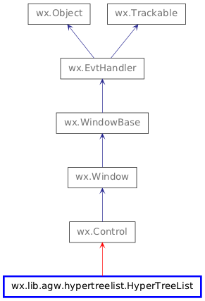
 Inheritance diagram for class HyperTreeList: