wx.CollapsiblePane
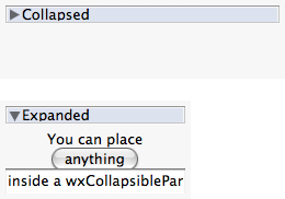
A collapsible pane is a container with an embedded button-like control which can be used by the user to collapse or expand the pane’s contents.
Once constructed you should use the GetPane function to access the pane and add your controls inside it (i.e. use the returned pointer from GetPane as parent for the controls which must go in the pane, not the wx.CollapsiblePane itself!).
Note that because of its nature of control which can dynamically (and drastically) change its size at run-time under user-input, when putting wx.CollapsiblePane inside a wx.Sizer you should be careful to add it with a proportion value of zero; this is because otherwise all other windows with non-null proportion values will automatically resize each time the user expands or collapse the pane window usually resulting in a weird, flickering effect.
Usage sample:
collpane = wx.CollapsiblePane(self, wx.ID_ANY, "Details:")

# add the pane with a zero proportion value to the 'sz' sizer which contains it
sz.Add(collpane, 0, wx.GROW | wx.ALL, 5)

# now add a test label in the collapsible pane using a sizer to layout it:
win = collpane.GetPane()
paneSz = wx.BoxSizer(wx.VERTICAL)
paneSz.Add(wx.StaticText(win, wx.ID_ANY, "test!"), 1, wx.GROW | wx.ALL, 2)
win.SetSizer(paneSz)
paneSz.SetSizeHints(win)
It is only available if USE_COLLPANE is set to 1 (the default).
 Window Styles
This class supports the following styles:
wx.CP_DEFAULT_STYLE: The default style. It includes wx.TAB_TRAVERSAL and wx.BORDER_NONE.
wx.CP_NO_TLW_RESIZE: By default wx.CollapsiblePane resizes the top level window containing it when its own size changes. This allows easily implementing dialogs containing an optionally shown part, for example, and so is the default behaviour but can be inconvenient in some specific cases –
 Events Emitted by this Class
Handlers bound for the following event types will receive one of the wx.CollapsiblePaneEvent wx.NavigationKeyEvent parameters.
EVT_COLLAPSIBLEPANE_CHANGED: The user expanded or collapsed the collapsible pane.
EVT_NAVIGATION_KEY: Process a navigation key event.
See also
 Class Hierarchy
 Inheritance diagram for class CollapsiblePane:
 Control Appearance
 Methods Summary
Default constructor. |
|
Collapses or expands the pane window. |
|
Same as calling Collapse(false). |
|
Returns a pointer to the pane window. |
|
Returns |
|
Returns |
 Properties Summary
See |
 Class API
Possible constructors:
CollapsiblePane() -> None

CollapsiblePane(parent, id=ID_ANY, label='', pos=DefaultPosition,
                size=DefaultSize, style=CP_DEFAULT_STYLE, validator=DefaultValidator,
                name=CollapsiblePaneNameStr) -> None
A collapsible pane is a container with an embedded button-like control which can be used by the user to collapse or expand the pane’s contents.
 Overloaded Implementations:
__init__ (self)
Default constructor.
None
__init__ (self, parent, id=ID_ANY, label=’’, pos=DefaultPosition, size=DefaultSize, style=CP_DEFAULT_STYLE, validator=DefaultValidator, name=CollapsiblePaneNameStr)
Initializes the object and calls Create with all the parameters.
parent (wx.Window)
id (wx.WindowID)
label (string)
pos (wx.Point)
size (wx.Size)
style (long)
validator (wx.Validator)
name (string)
None
Collapses or expands the pane window.
collapse (bool)
None
parent (wx.Window) – Parent window, must not be not None.
id (wx.WindowID) – The identifier for the control.
label (string) – The initial label shown in the button which allows the user to expand or collapse the pane window.
pos (wx.Point) – Initial position.
size (wx.Size) – Initial size.
style (long) – The window style, see CP_ flags.
validator (wx.Validator) – Validator which can be used for additional data checks.
name (string) – Control name.
bool
True if the control was successfully created or False if creation failed.
Same as calling Collapse(false).
None
variant (WindowVariant)
Returns a pointer to the pane window.
Add controls to the returned wx.Window to make them collapsible.
Returns True if the pane window is currently hidden.
bool
Returns True if the pane window is currently shown.
bool