wx.TextCtrl
A text control allows text to be displayed and edited.
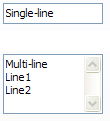
It may be single line or multi-line. Notice that a lot of methods of the text controls are found in the base wx.TextEntry class which is a common base class for wx.TextCtrl and other controls using a single line text entry field (e.g. wx.ComboBox).
 Window Styles
This class supports the following styles:
wx.TE_PROCESS_ENTER: The control will generate the event wxEVT_TEXT_ENTER that can be handled by the program. Otherwise, i.e. either if this style not specified at all, or it is used, but there is no event handler for this event or the event handler called wx.Event.Skip to avoid overriding the default handling, pressing Enter key is either processed internally by the control or used to activate the default button of the dialog, if any.
wx.TE_PROCESS_TAB: Normally, TAB key is used for keyboard navigation and pressing it in a control switches focus to the next one. With this style, this won’t happen and if the TAB is not otherwise processed (e.g. by wxEVT_CHAR event handler), a literal TAB character is inserted into the control. Notice that this style has no effect for single-line text controls when using wxGTK.
wx.TE_MULTILINE: The text control allows multiple lines. If this style is not specified, line break characters should not be used in the controls value.
wx.TE_PASSWORD: The text will be echoed as asterisks.
wx.TE_READONLY: The text will not be user-editable.
wx.TE_RICH: Use rich text control under MSW, this allows having more than 64KB of text in the control. This style is ignored under other platforms and it is recommended to use wx.TE_RICH2 instead of it under MSW.
wx.TE_RICH2: Use rich text control version 2.0 or higher under MSW, this style is ignored under other platforms. Note that this style may be turned on automatically even if it is not used explicitly when creating a text control with a long (i.e. much more than 64KiB) initial text, as creating the control would simply fail in this case under MSW if neither this style nor wx.TE_RICH is used.
wx.TE_AUTO_URL: Highlight the URLs and generate the TextUrlEvents when mouse events occur over them.
wx.TE_NOHIDESEL: By default, the Windows text control doesn’t show the selection when it doesn’t have focus - use this style to force it to always show it. It doesn’t do anything under other platforms.
wx.HSCROLL: A horizontal scrollbar will be created and used, so that text won’t be wrapped.
wx.TE_NO_VSCROLL: For multiline controls only: vertical scrollbar will never be created. This limits the amount of text which can be entered into the control to what can be displayed in it under wxMSW but not under wxGTK or wxOSX. Currently not implemented for the other platforms.
wx.TE_LEFT: The text in the control will be left-justified (default).
wx.TE_CENTRE: The text in the control will be centered (wxMSW, wxGTK, wxOSX).
wx.TE_RIGHT: The text in the control will be right-justified (wxMSW, wxGTK, wxOSX).
wx.TE_DONTWRAP: Same as wx.HSCROLL style: don’t wrap at all, show horizontal scrollbar instead.
wx.TE_CHARWRAP: For multiline controls only: wrap the lines too long to be shown entirely at any position (wxUniv, wxGTK, wxOSX).
wx.TE_WORDWRAP: For multiline controls only: wrap the lines too long to be shown entirely at word boundaries (wxUniv, wxMSW, wxGTK, wxOSX).
wx.TE_BESTWRAP: For multiline controls only: wrap the lines at word boundaries or at any other character if there are words longer than the window width (this is the default).
TE_CAPITALIZE: On PocketPC and Smartphone, causes the first letter to be capitalized.
Note that alignment styles (wx``wx.TE_LEFT``, wx.TE_CENTRE and wx.TE_RIGHT) can be changed dynamically after control creation on wxMSW, wxGTK and wxOSX. wx.TE_READONLY, wx.TE_PASSWORD and wrapping styles can be dynamically changed under wxGTK but not wxMSW. The other styles can be only set during control creation.
TextCtrl Text Format¶The multiline text controls always store the text as a sequence of lines separated by '\n' characters, i.e. in the Unix text format even on non-Unix platforms. This allows the user code to ignore the differences between the platforms but at a price: the indices in the control such as those returned by GetInsertionPoint or GetSelection can not be used as indices into the string returned by GetValue as they’re going to be slightly off for platforms using "\\r\\n" as separator (as Windows does). Instead, if you need to obtain a substring between the 2 indices obtained from the control with the help of the functions mentioned above, you should use GetRange And the indices themselves can only be passed to other methods, for example SetInsertionPoint or SetSelection To summarize: never use the indices returned by (multiline) wx.TextCtrl as indices into the string it contains, but only as arguments to be passed back to the other wx.TextCtrl methods. This problem doesn’t arise for single-line platforms however where the indices in the control do correspond to the positions in the value string.
TextCtrl Positions and Coordinates¶It is possible to use either linear positions, i.e. roughly (but not always exactly, as explained in the previous section) the index of the character in the text contained in the control or X-Y coordinates, i.e. column and line of the character when working with this class and it provides the functions PositionToXY and XYToPosition to convert between the two. Additionally, a position in the control can be converted to its coordinates in pixels using PositionToCoords which can be useful to e.g. show a popup menu near the given character. And, in the other direction, wx.HitTest can be used to find the character under, or near, the given pixel coordinates. To be more precise, positions actually refer to the gaps between characters and not the characters themselves. Thus, position 0 is the one before the very first character in the control and so is a valid position even when the control is empty. And if the control contains a single character, it has two valid positions: 0 before this character and 1 – after it. This, when the documentation of various functions mentions “invalid position”, it doesn’t consider the position just after the last character of the line to be invalid, only the positions beyond that one (e.g. 2 and greater in the single character example) are actually invalid.
TextCtrl Styles¶Multi-line text controls support styling, i.e. provide a possibility to set colours and font for individual characters in it (note that under Windows TE_RICH style is required for style support). To use the styles you can either call SetDefaultStyle before inserting the text or call SetStyle later to change the style of the text already in the control (the first solution is much more efficient). In either case, if the style doesn’t specify some of the attributes (for example you only want to set the text colour but without changing the font nor the text background), the values of the default style will be used for them. If there is no default style, the attributes of the text control itself are used. So the following code correctly describes what it does: the second call to SetDefaultStyle doesn’t change the text foreground colour (which stays red) while the last one doesn’t change the background colour (which stays grey):
text.SetDefaultStyle(wx.TextAttr(wx.RED))
text.AppendText("Red text\n")
text.SetDefaultStyle(wx.TextAttr(wx.NullColour, wx.LIGHT_GREY))
text.AppendText("Red on grey text\n")
text.SetDefaultStyle(wx.TextAttr(wx.BLUE))
text.AppendText("Blue on grey text\n")
TextCtrl and C++ Streams¶This class multiply-inherits from std::streambuf (except for some really old compilers using non-standard iostream library), allowing code such as the following:
# C++-style stream support is not implemented for Python.
Note that even if your build of wxWidgets doesn’t support this (the symbol HAS_TEXT_WINDOW_STREAM has value of 0 then) you can still use wx.TextCtrl itself in a stream-like manner:
# C++-style stream support is not implemented for Python.
However the possibility to create a std::ostream associated with wx.TextCtrl may be useful if you need to redirect the output of a function taking a std::ostream as parameter to a text control. Another commonly requested need is to redirect std::cout to the text control. This may be done in the following way:
# C++-style stream support is not implemented for Python.
But wxWidgets provides a convenient class to make it even simpler so instead you may just do
# C++-style stream support is not implemented for Python.
See StreamToTextRedirector for more details.
Event Handling¶The following commands are processed by default event handlers in wx.TextCtrl: ID_CUT , ID_COPY , ID_PASTE , ID_UNDO , ID_REDO . The associated UI update events are also processed automatically, when the control has the focus.
 Events Emitted by this Class
Handlers bound for the following event types will receive one of the wx.CommandEvent parameters.
EVT_TEXT: Respond to a wxEVT_TEXT event, generated when the text changes. Notice that this event will be sent when the text controls contents changes – wx.TextCtrl.SetValue is called); see wx.TextCtrl.ChangeValue for a function which does not send this event. This event is however not sent during the control creation.
EVT_TEXT_ENTER: Respond to a wxEVT_TEXT_ENTER event, generated when enter is pressed in a text control which must have wx.TE_PROCESS_ENTER style for this event to be generated.
EVT_TEXT_URL: A mouse event occurred over an URL in the text control.
EVT_TEXT_MAXLEN: This event is generated when the user tries to enter more text into the control than the limit set by wx.TextCtrl.SetMaxLength , see its description.
See also
 Class Hierarchy
 Inheritance diagram for class TextCtrl:
 Control Appearance
 Methods Summary
Default constructor. |
|
Creates the text control for two-step construction. |
|
Resets the internal modified flag as if the current changes had been saved. |
|
Delete the undo history. |
|
This function inserts into the control the character which would have been inserted if the given key event had occurred in the text control. |
|
Returns the style currently used for the new text. |
|
Gets the length of the specified line, not including any trailing newline character(s). |
|
Returns the contents of a given line in the text control, not including any trailing newline character(s). |
|
Returns the number of lines in the text control buffer. |
|
Returns the style at this position in the text control. |
|
Turn off the widget’s native caret on Windows. |
|
Finds the position of the character at the specified point. |
|
Finds the row and column of the character at the specified point. |
|
Returns |
|
Returns |
|
Returns |
|
Loads and displays the named file, if it exists. |
|
Turn on the native spell checking for the text widget on |
|
Mark text as modified (dirty). |
|
Disables all automatic character substitutions. |
|
Enables the automatic conversion of two |
|
Enables the automatic replacement of straight ( |
|
Enables the automatic replacement of new lines characters in a single-line text field with spaces under macOS. |
|
Converts given text position to client coordinates in pixels. |
|
Converts given position to a zero-based column, line number pair. |
|
Saves the contents of the control in a text file. |
|
Changes the default style to use for the new text which is going to be added to the control. |
|
Marks the control as being modified by the user or not. |
|
Changes the style of the given range. |
|
Turn on the widget’s native caret on Windows. |
|
Makes the line containing the given position visible. |
|
Converts the given zero based column and line number to a position. |
|
|
|
Append text to the textctrl, for file-like compatibility. |
 Properties Summary
See |
|
See |
 Class API
Possible constructors:
TextCtrl() -> None

TextCtrl(parent, id=ID_ANY, value='', pos=DefaultPosition,
         size=DefaultSize, style=0, validator=DefaultValidator,
         name=TextCtrlNameStr) -> None
A text control allows text to be displayed and edited.
 Overloaded Implementations:
__init__ (self)
Default constructor.
None
__init__ (self, parent, id=ID_ANY, value=’’, pos=DefaultPosition, size=DefaultSize, style=0, validator=DefaultValidator, name=TextCtrlNameStr)
Constructor, creating and showing a text control.
parent (wx.Window) – Parent window. Should not be None.
id (wx.WindowID) – Control identifier. A value of -1 denotes a default value.
value (string) – Default text value.
pos (wx.Point) – Text control position.
size (wx.Size) – Text control size.
style (long) – Window style. See wx.TextCtrl.
validator (wx.Validator) – Window validator.
name (string) – Window name.
None
Note
The horizontal scrollbar (wx``wx.HSCROLL`` style flag) will only be created for multi-line text controls. Without a horizontal scrollbar, text lines that don’t fit in the control’s size will be wrapped (but no newline character is inserted). Single line controls don’t have a horizontal scrollbar, the text is automatically scrolled so that the insertion point is always visible.
See also
Creates the text control for two-step construction.
This method should be called if the default constructor was used for the control creation. Its parameters have the same meaning as for the non-default constructor.
parent (wx.Window)
id (wx.WindowID)
value (string)
pos (wx.Point)
size (wx.Size)
style (long)
validator (wx.Validator)
name (string)
bool
Resets the internal modified flag as if the current changes had been saved.
None
Delete the undo history.
Currently only implemented in wxMSW (for controls using wx.TE_RICH2 style only) and wxOSX (for multiline text controls only), does nothing in the other ports or for the controls not using the appropriate styles.
None
Added in version 4.1/wxWidgets-3.1.6.
This function inserts into the control the character which would have been inserted if the given key event had occurred in the text control.
The event object should be the same as the one passed to EVT_KEY_DOWN handler previously by wxWidgets. Please note that this function doesn’t currently work correctly for all keys under any platform but MSW.
event (wx.KeyEvent)
bool
True if the event resulted in a change to the control, False otherwise.
variant (WindowVariant)
Returns the style currently used for the new text.
See also
Gets the length of the specified line, not including any trailing newline character(s).
lineNo (long) – Line number (starting from zero).
int
The length of the line, or -1 if lineNo was invalid.
Returns the contents of a given line in the text control, not including any trailing newline character(s).
lineNo (long) – The line number, starting from zero.
str
The contents of the line.
Returns the number of lines in the text control buffer.
The returned number is the number of logical lines, i.e. just the count of the number of newline characters in the control + 1, for wxGTK and OSX/Cocoa ports while it is the number of physical lines, i.e. the count of lines actually shown in the control, in wxMSW. Because of this discrepancy, it is not recommended to use this function.
int
Note
Note that even empty text controls have one line (where the insertion point is), so GetNumberOfLines never returns 0.
Returns the style at this position in the text control.
Not all platforms support this function.
position (long)
style (wx.TextAttr)
bool
True on success, False if an error occurred (this may also mean that the styles are not supported under this platform).
See also
Turn off the widget’s native caret on Windows. Ignored on other platforms.
bool
Finds the position of the character at the specified point.
If the return code is not TE_HT_UNKNOWN the position of the character closest to this position is returned, otherwise the output parameter is not modified.
Please note that this function is currently only implemented in Univ, wxMSW and wxGTK ports and always returns TE_HT_UNKNOWN in the other ports.
Finds the row and column of the character at the specified point.
If the return code is not TE_HT_UNKNOWN the row and column of the character closest to this position are returned, otherwise the output parameters are not modified.
Please note that this function is currently only implemented in Univ, wxMSW and wxGTK ports and always returns TE_HT_UNKNOWN in the other ports.
Returns True if the text has been modified by user.
Note that calling SetValue doesn’t make the control modified.
bool
See also
Returns True if this is a multi line edit control and False otherwise.
bool
See also
Returns True if this is a single line edit control and False otherwise.
bool
See also
Loads and displays the named file, if it exists.
filename (string) – The filename of the file to load.
fileType (int) – The type of file to load. This is currently ignored in wx.TextCtrl.
bool
True if successful, False otherwise.
Turn on the native spell checking for the text widget on OSX. Ignored on other platforms.
None
Mark text as modified (dirty).
None
See also
Disables all automatic character substitutions.
None
Added in version 4.1/wxWidgets-3.1.1.
Availability
Only available for OSX.
Enables the automatic conversion of two ASCII hyphens into an em dash.
This feature is enabled by default.
enable (bool)
None
Added in version 4.1/wxWidgets-3.1.1.
Availability
Only available for OSX.
Enables the automatic replacement of straight (ASCII) quotation marks and apostrophes with smart (“curly”) quotes.
This feature is enabled by default.
enable (bool)
None
Added in version 4.1/wxWidgets-3.1.1.
Availability
Only available for OSX.
Enables the automatic replacement of new lines characters in a single-line text field with spaces under macOS.
This feature is enabled by default and will replace any new line ( \n ) character entered into a single-line text field with the space character. Usually single-line text fields are not expected to hold multiple lines of text (that is what wx.TE_MULTILINE is for, after all) and it is impossible to have multiple lines of text in them under non-Mac platforms. However, under macOS/Cocoa, a single-line text control can still show multiple lines and this function allows to lift the restriction preventing multiple lines from being entered unless wx.TE_MULTILINE is specified.
enable (bool)
None
Added in version 4.1/wxWidgets-3.1.6.
Availability
Only available for OSX.
Note
Has no effect if the wx.TE_MULTILINE flag is set on a text control.
Converts given text position to client coordinates in pixels.
This function allows finding where is the character at the given position displayed in the text control.
pos (long) – Text position in 0 to GetLastPosition range (inclusive).
On success returns a wx.Point which contains client coordinates for the given position in pixels, otherwise returns wx.DefaultPosition .
Added in version 2.9.3.
Availability
Only available for MSW, GTK . Additionally, wxGTK only implements this method for multiline controls and wx.DefaultPosition is always returned for the single line ones.
See also
Converts given position to a zero-based column, line number pair.
pos (long) – Position.
Tuple[bool, int, int]
Saves the contents of the control in a text file.
filename (string) – The name of the file in which to save the text.
fileType (int) – The type of file to save. This is currently ignored in wx.TextCtrl.
bool
True if the operation was successful, False otherwise.
Changes the default style to use for the new text which is going to be added to the control.
This applies both to the text added programmatically using WriteText or AppendText and to the text entered by the user interactively.
If either of the font, foreground, or background colour is not set in style, the values of the previous default style are used for them. If the previous default style didn’t set them either, the global font or colours of the text control itself are used as fall back.
However if the style parameter is the default wx.TextAttr, then the default style is just reset (instead of being combined with the new style which wouldn’t change it at all).
style (wx.TextAttr) – The style for the new text.
bool
True on success, False if an error occurred (this may also mean that the styles are not supported under this platform).
See also
Marks the control as being modified by the user or not.
modified (bool)
None
See also
Changes the style of the given range.
If any attribute within style is not set, the corresponding attribute from GetDefaultStyle is used.
start (long) – The start of the range to change.
end (long) – The end of the range to change.
style (wx.TextAttr) – The new style for the range.
bool
True on success, False if an error occurred (this may also mean that the styles are not supported under this platform).
See also
Turn on the widget’s native caret on Windows. Ignored on other platforms.
bool
Makes the line containing the given position visible.
pos (long) – The position that should be visible.
None
Converts the given zero based column and line number to a position.
x (long) – The column number.
y (long) – The line number.
int
The position value, or -1 if x or y was invalid.
NOP, for file-like compatibility.
None
Append text to the textctrl, for file-like compatibility.
None
See GetDefaultStyle and SetDefaultStyle
See GetNumberOfLines